For the last several years I have published a set of team ratings that I call "Crude Team Ratings". The name was chosen to reflect the nature of the ratings--they have a number of limitations, of which I documented several when I introduced the methodology.
I explain how CTR is figured in the linked post, but in short:
1) Start with a win ratio figure for each team. It could be actual win ratio, or an estimated win ratio.
2) Figure the average win ratio of the team’s opponents.
3) Adjust for strength of schedule, resulting in a new set of ratings.
4) Begin the process again. Repeat until the ratings stabilize.
The resulting rating, CTR, is an adjusted win/loss ratio rescaled so that the majors’ arithmetic average is 100. The ratings can be used to directly estimate W% against a given opponent (without home field advantage for either side); a team with a CTR of 120 should win 60% of games against a team with a CTR of 80 (120/(120 + 80)).
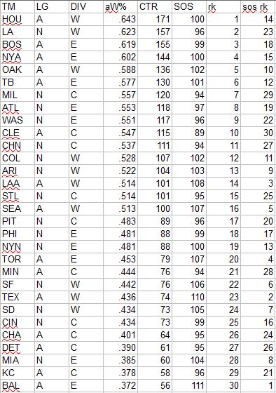
First, CTR based on actual wins and losses. In the table, “aW%” is the winning percentage equivalent implied by the CTR and “SOS” is the measure of strength of schedule--the average CTR of a team’s opponents. The rank columns provide each team’s rank in CTR and SOS:

The playoff teams all finished in the top twelve, with the third-place teams from the top-heavy AL East and West being denied spots in the dance despite having the fifth/sixth most impressive records in the majors (and damn the .3 CTR that separated us from #6org). The AL also had four of the bottom five teams; the bifurcated nature of the AL is something that was well observed and noted from the standings but also is evident when adjusting for strength of schedule. Note the hellish schedule faced by bad AL teams; Baltimore, with the worst CTR in MLB, had the toughest SOS at 118 - an average opponent at the level of the Cubs. Those Cubs had the easiest schedule, playing an average opponent roughly equivalent to the Pirates.
Next are the division averages. Originally I gave the arithmetic average CTR for each division, but that’s mathematically wrong--you can’t average ratios like that. Then I switched to geometric averages, but really what I should have done all along is just give the arithmetic average aW% for each division/league. aW% converts CTR back to an “equivalent” W-L record, such that the average across the major leagues will be .50000:

The AL once again was markedly superior to the NL; despite the sorry showing of the Central, the West was almost as good as it was bad, and the East was strong as well. Given the last fifteen years of AL dominance, you may have glossed over the last sentence, but if you are familiar with the results of 2018 interleague play, it may give you pause. The NL went 158-142 against the AL, so how does the average AL team rank ahead? It may be counter-intuitive, but one can easily argue that the NL should have performed better than it did. The NL’s best division got the benefit of matching up with the AL’s worst division (the Centrals). The AL Central went 38-62 (.380), but the East went 54-46 (.540) and the West 50-50 (.500).
Of course, the CTRs can also use theoretical win ratios as a basis, and so the next three tables will be presented without much comment. The first uses gEW%, which is a measure I calculate that looks at each team’s runs scored distribution and runs allowed distribution separately to calculate an expected winning percentage given average runs allowed or runs scored, and then uses Pythagorean logic to combine the two and produce a single estimated W% based on the empirical run distribution:

The next version utilizes EW%, which is to say standard Pythagenpat based on actual runs scored and allowed:

And one based on PW%, which is Pythagenpat but using runs created and runs created allowed in place of actual runs totals:
Everything that I’ve shared so far has been based on regular season data only. Of course, ten teams play additional games for keeps, and we could consider these in ratings as well. Some points to consider when it comes to incorporating postseason data:
1. It would be silly to pretend that these additional games don’t give us any insight on team quality. Of course every opportunity we have to observe a team in a competitive situation increases our sample size and informs our best estimate of that team’s quality.
2. Postseason games are played under a different set of conditions and constraints than regular season games, particularly when it comes to how pitchers are used. This is not a sufficient reason to ignore the data, in my opinion.
3. A bigger problem, and one that causes me to present ratings that include postseason performance only half-hardheartedly, is the bias introduced to the ratings by the playoff structure. The nature of postseason series serves to exaggerate the difference in team performance observed during the series. Take the Astros/Indians ALCS. The Astros dominated the Indians over three games, which certainly provides additional evidence vis-a-vis the relative strength of the two teams. Based on regular season performance, Houston looked like a superior club (175 to 113 CTR, implying that they should win 61% of their games against the Indians), and the sweep provided additional evidence. However, because the series terminated after three games, all won by the Astros, it overstated the difference. If the series was played out to completion (assuming you can imagine a non-farcial way in which this could be done), we would expect to see Cleveland pull out a win, and even adding 1-4 and 4-1 to these two team’s ratings would decrease the CTR gap between the two (although still correctly increasing it compared to considering only the regular season).
This is one of those concepts that seems very clear to me when I think about it, and yet is extremely difficult to communicate in a coherent manner, so let me simply assert that I think bias is present when the number of observations is dependent on the outcome of the previous observations (like in a playoff series) that is not present when the number of observations is independent of the outcome of previous observations (as is the case for a regular season in which all teams play 162 games regardless of whether they are mathematically eliminated in August).
Still, I think it’s worth looking at CTRs including the post-season; I only will present these for actual wins and losses, but of course if you were so inclined you could base them on estimated winning percentages as well:

Here is a comparison of CTR including postseason (pCTR) to the regular season-only version, and the difference between the two:

I’ve been figuring CTRs since 2011 and playoff-inclusive versions since 2013, so Boston’s rating in both stood out when I saw it. I thought it might be interesting to look at the leader in each category each season. The 2018 Red Sox are the highest-rated team of the past eight seasons by a large margin (of course, such ratings do nothing to estimate any kind of underlying differences in MLB-wide quality between seasons):

I didn’t realize that the 2017 Dodgers were the previous leaders; I would have guessed it was the 2016 Cubs, although they would be much farther down the list. It is also worth noting that this year’s Astros would have been ranked #1 of the period were it not for the Red Sox. Boston’s sixteen point improvement including the playoffs was easily the best for any team that had been ranked #1, and that does make sense intuitively: 3-1 over the #3 ranked (regular season) Yankees, 4-1 over #2 ranked Houston, and 4-1 over the #9 Dodgers is one impressive playoff showing.
Tuesday, December 18, 2018
Crude Team Ratings, 2018
Monday, December 10, 2018
Hitting by Position -- 2018
Of all the annual repeat posts I write, this is the one which most interests me--I have always been fascinated by patterns of offensive production by fielding position, particularly trends over baseball history and cases in which teams have unusual distributions of offense by position. I also contend that offensive positional adjustments, when carefully crafted and appropriately applied, remain a viable and somewhat more objective competitor to the defensive positional adjustments often in use, although this post does not really address those broad philosophical questions.
The first obvious thing to look at is the positional totals for 2018, with the data coming from Baseball-Reference.com. "MLB” is the overall total for MLB, which is not the same as the sum of all the positions here, as pinch-hitters and runners are not included in those. “POS” is the MLB totals minus the pitcher totals, yielding the composite performance by non-pitchers. “PADJ” is the position adjustment, which is the position RG divided by the overall major league average (this is a departure from past posts; I’ll discuss this a little at the end). “LPADJ” is the long-term positional adjustment that I use, based on 2002-2011 data. The rows “79” and “3D” are the combined corner outfield and 1B/DH totals, respectively:

An annual review of this data is problematic because it can lead to seeing trends where there are actually just blips. Two years ago second basemen smashed their way to unprecedented heights; this year they were right back at their long-term average. In 2017, DHs were 4% worse than the league average -- in 2018 they were part of what one could call the left side convergence of the defensive spectrum, as DH, 1B, LF, RF, and 3B all basically hit the same. Shortstops were above league average, which is of note, while catchers and center fielders also ended up right at their normal levels (yes, I really should update my “long-term” positional adjustments; I promise to do that for next year).
Moving on to looking at more granular levels of performance, I always start by looking at the NL pitching staffs and their RAA. I need to stress that the runs created method I’m using here does not take into account sacrifices, which usually is not a big deal but can be significant for pitchers. Note that all team figures from this point forward in the post are park-adjusted. The RAA figures for each position are baselined against the overall major league average RG for the position, except for left field and right field which are pooled.

While positions relative to the league bounce around each year, it seems that the most predictable thing about this post is that the difference between the best and worst NL pitching staffs will be about twenty runs at the plate. Sixteen is a narrower spread than typical, but pitchers also fell to an all-time low -5 positional adjustment.
I don’t run a full chart of the leading positions since you will very easily be able to go down the list and identify the individual primarily responsible for the team’s performance and you won’t be shocked by any of them, but the teams with the highest RAA at each spot were:
C--LA, 1B--LA, 2B--HOU, 3B--CLE, SS--BAL, LF--MIL, CF--LAA, RF--BOS, DH--NYA
I don’t know about “shocked”, but I was surprised to see that Baltimore had the most productive shortstops. Not that I didn’t know that Manny Machado had a great “first half” of the season for the O’s, but I was surprised that whoever they threw out there for the rest of the year didn’t drag their overall numbers down further. In fact Tim Beckham and Jonathan Villar were perfectly cromulent (offensively at least, although Machado wasn’t lighting up any defensive metrics himself) and Baltimore finished two RAA ahead of the Red Sox (Bogaerts) and Indians (Lindor), and three runs ahead of the Rockies (Story).
More interesting are the worst performing positions; the player listed is the one who started the most games at that position for the team:

Boston’s catchers weren’t the worst relative to their position, but they were the worst hitting regular position in MLB on a rate basis; teams can certainly overcome a single dreadful position, but they usually don’t do it to the tune of 108 wins. The most pathetic position was definitely the Orioles’ first basemen, with a healthy lead for lowest RAA thanks to having the fifth-worst RG of any regular position (only Red Sox catchers, Tigers second basemen, Diamondback catchers, and their own catchers were worse).
I like to attempt to measure each team’s offensive profile by position relative to a typical profile. I’ve found it frustrating as a fan when my team’s offensive production has come disproportionately from “defensive” positions rather than offensive positions (“Why can’t we just find a corner outfielder who can hit?”) The best way I’ve yet been able to come up with to measure this is to look at the correlation between RG at each position and the long-term positional adjustment. A positive correlation indicates a “traditional” distribution of offense by position--more production from the positions on the right side of the defensive spectrum. (To calculate this, I use the long-term positional adjustments that pool 1B/DH as well as LF/RF, and because of the DH I split it out by league.) There is no value judgment here--runs are runs whether they are created by first basemen or shortstops:

We’ve already seen that Milwaukee’s shortstops were the least productive in the majors and their left fielders the most productive, which helps explain their high correlation. Baltimore’s low correlation likewise makes sense as they had the least productive first basemen and the most productive shortstops.
The following tables, broken out by division, display RAA for each position, with teams sorted by the sum of positional RAA. Positions with negative RAA are in red, and positions that are +/-20 RAA are bolded:

Boston’s monstrously productive outfield easily led the majors in RAA (as did their corner outfielders), but the catchers dragged them down just behind New York. Baltimore was below-average at every position except shortstop, so after they dealt Machado it was really ugly. They were the worst in MLB at both the infield and outfield corners.

Cleveland’s offense had issues all over the place, but a pair of MVP candidates on the infield can cover that up, at least in the AL Central where every other team was below average. Chicago had the major’s worst outfield RAA while Detroit was last in the AL for middle infielders.

For a second straight season, Houston’s infield and middle infield were tops in the AL despite injuries slowing down Altuve and Correa. Oakland’s Matts led the majors in corner infield RAA. Los Angeles had the majors least productive infield, which for all its badness still couldn’t cancel out the Trout-led centerfielders.

Washington led the NL in corner outfield RAA. New York was last in the NL in corner infield RAA. Last year Miami led the majors in outfield RAA; this year they trailed. This comes as no surprise of course, but is still worthy of a sad note before chuckling at the dark, monochromatic threads they will wear in 2019.

This division was nearly the opposite of the AL Central, as every team had a positive RAA with room to spare. Chicago lead the majors in middle infield RAA; Milwaukee was the worst in the same category, but covered it over with the NL’s most productive outfield. I will admit to being as confused by their trade deadline manueverings at the next guy, but when you see so starkly how little they were getting out of their middle infield, the shakeup makes more sense. Of course one of the chief regular season offenders Orlando Arcia raked in the playoffs.

Los Angeles’ corner infielders led the majors in RAA, and dragged their middle infielders (well, really just the second basemen) to the best total infield mark as well. The rest of the division was below average, and Colorado’s corner outfielders were last in the NL which should provide a juicy career opportunity for someone.
The full spreadsheet with data is available here.