
Is it just me, or does this seem patently unfair to the other 28 teams?
Good to see that Yahoo! is well-prepared for continuous interleague play in 2013.
Thursday, December 27, 2012
Great Moments in Yahoo! Schedules
Monday, December 17, 2012
Hitting by Position, 2012
Offensive performance by position (and the closely related topic of positional adjustments) has always interested me, and so each year I like to examine the most recent season's totals. I believe that offensive positional averages can be an important tool for approximating the defensive value of each position, but they certainly are not a magic bullet and need to include more than one year of data if they are to be utilized in that capacity.
The first obvious thing to look at is the positional totals for 2012, with the data coming from Baseball-Reference.com. "MLB” is the overall total for MLB, which is not the same as the sum of all the positions here, as pinch-hitters and runners are not included in those. “POS” is the MLB totals minus the pitcher totals, yielding the composite performance by non-pitchers. “PADJ” is the position adjustment, which is the position RG divided by the overall major league average (this is a departure from past posts; I’ll discuss this a little at the end). “LPADJ” is the long-term positional adjustment that I use, based on 2002-2011 data. The rows “79” and “3D” are the combined corner outfield and 1B/DH totals, respectively:

The 2012 positional RG averages demonstrate a fairly remarkable convergence near 4.8 for a number of positions (third base, the three outfield spots, and DH all between 4.75-4.85). While this is nothing more than a one year data fluke, it’s the kind of thing that is fun when you find it. One thing that has persisted is left fielders being outperformed by their stronger armed brethren in right, although 4.8 RG represents a bounce back from their pitiful 4.45 performance in 2011. The other most notable position performance came from backstops, who were close to league average and outhit the middle infielders. For an odd but meaningless fact, note the excellent stolen base record of DHs--their 80 SB% was the best of any position.
Pitchers reached a new low in 2012; their .06 RG is close to breaking linear weights, and their PADJ of 1 represents a new all-time low (the previous nadir was 5). The team pitcher data below (and all of the team data for all positions that follows in this post) are park-adjusted. RAA is baselined against the overall major league average for the position (with left field and right field pooled). It’s worth noting that the formula I’m using for Runs Created is limited to the basic categories, so sacrifices are ignored, which could make a difference for pitchers:

An eighteen run range between the best and worst team pitchers is pretty common. Washington’s pitchers were clearly the best, leading in both batting and secondary average. Cincinnati’s BA was only five points lower and they tied for second in isolated power (behind Milwaukee), but only San Diego’s pitchers had a lower walk rate than the Reds. At the other end of the power and overall offense spectrum was Pittsburgh. They were last with a -.7 RG and -8 RAA, but their isolated power was a woeful .003 (the next lowest was Houston at .018).
Pittsburgh pitchers mustered just one double in 290 at bats--I didn’t check, but it’s tough to imagine any teams in history have topped that. AL pitchers in aggregate came pretty close, though, with just three doubles in 282 AB (.011 ISO). All AL teams had a pitcher reach base safely except the Tigers, but their 0-13 was offset by seven sacrifices to lead the AL. The best hitting pitchers were Cleveland with a .290 across-the-board slash line (six singles in 21 at bats).
I don’t bother running a full table for the team leaders in RAA at the positions that actually hit, as these are usually uninteresting (Tigers third basemen were good offensively? You don’t say). The leading teams by position were:
C--SF, 1B--CIN, 2B--NYA, 3B--DET, SS--WAS, LF--MIL, CF--PIT, RF--STL, DH--NYA
I find it a lot more interesting to look at the worst positions (the player listed is the one with the most games played for the team at the position):

Kevin Youkilis takes a bad rap here as he had a respectable 720 OPS in 316 PA as the Chicago third baseman; his teammates combined for 466 in 339 PA. If you endeavor to score 1,000 runs for the season, it might be a good idea to make sure that you don’t get the worst offensive production out of two of your positions. No amount of corner power can mitigate that. Although Pittsburgh’s left fielders were the worst in total value relative to their position, Seattle’s shortstops had the overall worst performance with 2.5 RG. They were actually matched in production by their team’s pitchers, who hit a raw .227/.261/.273 for 2.5 RG (the park adjustment should not be applied to AL pitchers because all of their PA--except for rare cases that tend to involve Joe Maddon--come on the road). Obviously the pitchers’ performance came over a microscopic 23 PA, but it’s a factoid with some nice shock value.
A few years ago I wrote a bit about teams with unusual profiles of offense by position. This topic has been of particular interest to me in recent years because of the way the Indians have been constructed--often they have gotten good production from positions on the right side of the defensive spectrum while struggling at the more offensively-inclined positions. The easiest way I’ve come up with to express this numerically is the correlation between a team’s RG by position and the long-term positional adjustment (I’ve pooled left and right field but not 1B and DH in this case; pitchers are excluded for all teams and DHs excluded for NL teams, and I’ve broken the lists out by league because of this):

As I suspected, the Indians displayed one of the strongest inverse correlations between positional expectation and actual production with the most negative correlation in the AL. Cincinnati had the strongest correlation in the majors; contrasting the two Ohio teams should illustrate how these results came about:

The Reds got their best production out of first base and the corner outfielders, and their middle infielders and catchers had relatively low RGs. Only center field produced contrary to expectation in a meaningful way. The Indians, on the other hand, got no offense from first base and left field. While right field was productive as would be expected, the other top positions included the middle infielders and catcher.
Perhaps it’s my experience as an Indians fan speaking, but I feel that the type of pattern displayed by the Indians in recent years is the most frustrating as a fan. Cleveland has gotten solid production from catcher (Martinez/Santana), second base (Kipnis recently), shortstop (Peralta/Cabrera), center field (Sizemore/Brantley)...and has struggled to find first basemen (Garko/LaPorta/Kotchman) or left fielders (Michaels/Duncan/Damon/etc) who could provide league average (overall, not even relative to position) production.
The following charts give the RAA at each position for each team, split up by division. The charts are sorted by the sum of RAA for the listed positions. As mentioned earlier, the league totals will not sum to zero since the overall ML average is being used and not the specific league average. Positions with negative RAA are in red; positions with +/- 20 RAA are bolded:

Washington led the NL in infield RAA, with excellent performances from first base and shortstop. The Desmond-led shortstops stood out enough to lift the Nats to the NL lead in middle infield RAA, and they just missed leading in corner infield RAA as well. The worst production from corner infielders in the NL was a dead heat between the Phillies and the Marlins. Miami joined Cleveland and Seattle as the only teams with -20 RAA performances from both first base and left field.

St. Louis and Milwaukee boasted the top two outfields in the NL; the Brewers had the best production from corner outfielders in the majors, but St. Louis’ average production in center field gave them a higher composite RAA. Cincinnati’s offense was a conundrum, ranking fourth to last in the league in park adjusted R/G. Their component performance was better than that, but even so one might have expected more than a composite 20 RAA from their positions. The Reds’ center fielders were dreadful, though. Leading the majors in first base RAA may seem surprising at first glance, but much of Frazier’s hot stretch came as Votto’s replacement (884 OPS in 149 PA). Pittsburgh’s middle infielders ranked last in the NL, but at just -15 RAA. Houston was last in the majors in corner outfield RAA and their center fielders were only one run worse than Cincinnati’s for a total of -75 outfield RAA, 29 runs worse than the next sorriest outfit. That outfield belonged to the Cubs, who were also last in the NL in corner infield and overall infield RAA.

San Francisco’s offense was a wonderful example of above-average balance plus the MVP, enough to rank third in the league in RAA. Chase Headley powered the Padres to the NL’s highest corner infield RAA.

New York led the majors in middle infield and overall infield RAA. Boston’s outfield was the worst in the AL, and just two above average positions speaks to how poorly their season went. The amount of red on this chart is fairly staggering given the extent to which the media still hypes the difficulty of pitching in the AL East.

Detroit’s much-hyped duo contributed a whopping 90 RAA to lead corner infielders, but the black hole at second base gave 27 runs back, and the lack of any other standout positions aside from center once again reinforce just how stupid it was to mention “1,000 runs” and this team in the same sentence. Their corner outfielders were last in the AL in RAA. Minnesota was last in the majors in middle infield RAA, while Cleveland achieved the same with their corner infielders. In fact, despite Detroit’s 90 corner infield RAA, the division combined for -11 RAA from corner infielders as only Chicago got above-average production from either position.

Los Angeles led the AL in corner outfield RAA and the majors in total outfield RAA. The lack of offense in Seattle is as predictable as the rain and the votes for liberals, but marveling at it never gets old (unlike the other constants of Seattle life). Their corner outfielders were last in AL RAA and their infielders last in the majors. Only their catchers, led by John Jaso, were above average.
The full spreadsheet is available here.
Switching gears to some technical explanation, the position adjustments I am now using are based on comparing each position’s RG to the overall major league average. Previously, the adjustments I used were based on comparing each position to the league average with pitchers removed. The latter comparison is certainly cleaner, but it was inconsistent with how I was actually calculating RAA and RAR, which was comparing each player to the overall league average.
The new method is not perfect either; one could very persuasively argue that pitchers hitting should be removed from the league average for all computations. I’ve always subscribed to the notion that the league totals for any average-baselined stat should be zero, and that the league average should be the same whether one is comparing players or teams. If you take out pitchers from the league average, but leave them in for teams (and pitcher hitting does factor into actual team offensive output, even if the variance is much lower than for other positions), then you wind up with a league which rates as below average offensively.
Of course, the notion of looking at the leagues as self-contained units made much more sense when they were. Now the AL averages include not only pitchers hitting, but also performances compiled against NL teams. I cling to the notion of separate leagues for computational purposes because the separation is still great enough that it’s a better approximation than lumping both leagues together, but both are imprecise.
This is a particular problem for positional adjustments, because the AL average and the NL average include different proportions of pitcher’s hitting. In the pre-interleague days, even if one tied themself to using the league average including pitchers, it may have made sense to use a PADJ tied to all positions for the NL and less pitchers for the AL. I choose not to complicate things by using a different set of positional adjustments for each league, especially now that both choices are at least partially incorrect. This imprecision does not cause huge distortion, but I need to disclose it nonetheless.
Monday, December 10, 2012
Hitting by Lineup Position, 2012
I devoted a whole post to leadoff hitters, whether justified or not, so it's only fair to have a post about hitting by batting order position in general. I certainly consider this piece to be more trivia than sabermetrics, since there’s no analytical content.
The data in this post was taken from Baseball-Reference. The figures are park-adjusted. RC is ERP, including SB and CS, as used in my end of season stat posts. The weights used are constant across lineup positions; there was no attempt to apply specific weights to each position, although they are out there and would certainly make this a little bit more interesting.

NL #3 hitters retained the highest RG of any league-slot for the fourth consecutive year. AL teams were more balanced between #3 and #4, with the cleanup hitters holding a slight edge in RG built on BA (.275 to .264) but slightly less power (.189 to .193 ISO). NL leadoff me had a lower OBA than any other NL slots except 7, 8, and 9, and the #7 hitters managed to exceed their overall production (if you remove the Reds leadoff hitters, they did muster a higher RG than the #7s). AL teams were much better at leadoff, but gave those gains right back with poor #2 hitters.
Next, here are the team leaders in RG at each lineup position. The player listed is the one who appeared in the most games in that spot (which can be misleading, particularly for the bottom the batting order where there is no fixed regular, or injury cases like Evan Longoria getting stuck with the blame for the Rays’ cleanup hitters):

A few teams had the best production in their league at a pair of slots that are considered particularly important--the Angels at #1/2, the Tigers at #3/4, the Giants at #1/4. But the Cardinals got the best production of their NL rivals from #2, #6, and #8.
And the least productive:

The Astros and Royals both had two black holes in the middle of their order while the Chicago teams each trailed at #2 and a lower lineup position. Note that even in this lousy company, the Reds leadoff hitters had the worst OBA among the other league-worst positions except for the Pirates #9.
The next chart displays the top ten positions in terms of runs above average, compared to the average position for their league. To emphasize that, the RAA numbers here are, for example, the Angels #1 hitters compared to the other AL #1 hitters:

Even when you compare to the average for each slot, the top RAA figures are dominated by the expected slots. Please don’t use the fact that Trout outshone his leadoff peers by more than Cabrera outshone his #3 peers to bolster an MVP case--that would be silly on principle, and the performance of other players are include in the team figures reported here.
And the worst positions:

I wrote enough about Cincinnati’s leadoff hitters in an earlier post, but to pile on: their 2.6 RG was worse than any non-#9 spot for any other major league team. It was worse than the #9 slot of all but one American League team (CHA), making it the second-worst non-pitcher slot in the major leagues. Washington’s #9 hitters outhit Cincinnati’s leadoff hitters (2.7 RG to 2.6). They also had the 13th lowest walk rate of any position (8th lowest excluding NL #9s). Their OBA was 15th lowest of any position--and rock bottom when NL #9s are excluded. I marveled a few times during the season at Dusty Baker’s choices at the top of the order, but I had no idea that it was this bad until digging into the numbers.
I will close this post with a chart showing each team’s rank in RG in their league for each slot. The top and bottom three teams in each league have been highlighted. First the AL:

Last year this chart for Boston was filled with bold--this year they ranked in the bottom half of the AL in six of the nine spots, and only the #6 hitters weren’t borderline. Not much has changed in Seattle, except last year their ineptitude was centered at 4-6 rather than 1-4.
In the NL:

Based on talent or actual performance, Cincinnati had no business finishing fourth last in the NL in park-adjusted R/G. But that outcome starts to make a little more sense when you consider the leadoff disaster coupled with poor production from the cleanup hitters (.263/.323/.428).
Follow this link for the full spreadsheet.
Monday, December 03, 2012
Statistical Meanderings 2012
This post is probably shorter than in past years, which is good for you if you choose to read. There’s not much of substance here--just a few observations about quirky things in my stat reports that happened to catch my eye. Jayson Stark-level stuff, but with better (I hope) stats.
* If I could only know one statistic regarding each major league season, I would want to know the league average of runs per game. It is the simplest way to boil down the environment in which the game is played into a single number. As such, I like to make note of how it fluctuates from year to year, even if one cannot draw any conclusions about long-term trends from single seasons. In fact, I consider this number so important that I refer to it as N in my league stat report.
Runs were up slightly in the majors in 2012 relative to 2011, with an uptick in NL scoring leading the way. N for the 2012 was AL was 4.45 versus 4.46 in 2011, but the NL’s crept up to 4.22 from 4.13. I should note that interleague play has made it more difficult to look at N for each league, since runs no longer equal runs allowed for the league. The version here is just runs scored, which I persist with by convention and expediency rather than anything I can justify to you.
* Home W% also rebounded a bit after cratering in 2011. Home teams won at a .533 clip in 2012, up from .526, but well behind the conspiracy theory-inspiring .559 of 2010. Four of thirty teams had better record on the road, while there were seven such teams in 2011, and just two in 2012. Again, trends need to be observed over time.
* As the Rays fell out of contention in September, one factor that was bandied about in mainstream circles was a decline in their team fielding. It’s true that Tampa went from leading the majors in modified FA in 2011 (.978) to bringing up the rear in the AL in 2012 (.963), but their DER remained excellent. Tampa’s .694 was good enough for a virtual five-way tie for the ML lead (SEA, LAA, OAK, and WAS were all at either .695 or .694).
And the Rays pitching was outstanding; they narrowly missed leading the majors in both starter (their 3.90 led the AL by a large margin as DET was second at 4.26, but WAS was at 3.85) and reliever eRA (the closest challenger to their 3.19 was the Reds at 3.44).
* Given the fact that Colorado spent a good chunk of the season dabbling with a pitch-restricted four man rotation, it’s not a surprise that their starting staff put up some unusual numbers. But there are a few that really catch the eye:
- COL got quality starts in just 17% of their games (Coors doesn’t help QS% of course, but regardless of the park, you don’t get a quality start without pitching six innings); MIN was next lowest at 38%.
- COL starters logged 4.72 innings per start; MIN was next with 5.43
- COL starters had a 5.71 eRA (this figure is park-adjusted), but it was not the worst in the majors. That fate belonged to...the Twins (5.73).
* The four lowest scoring teams in the majors played in the National League, which isn’t shocking, but the fact that every AL team outscored the Reds was very surprising to me. CIN’s 4.05 R/G was well ahead of their two division rivals, at least--Houston (3.64) and the Cubs (3.67) brought up the rear, and Miami didn’t do much better (3.76). The Marlins and Reds were the two most underachieving offensive teams in terms of scoring fewer runs than predicted by Base Runs, with respective shortfalls of 47 and 40 runs.
Of course, that means the fifth lowest-scoring offense belonged to an AL team, and if you’ve been paying any attention at all over the last few seasons, you should guess that it was Seattle. You’d be right--the Mariners mustered just 4.06 R/G, which was actually better than their RC/G (4.04). Seattle was last in home R/G (3.17--the Mets were next at 3.54), but ranked eighth in road R/G (4.47; for reference, TEX was at 4.46). The Mets were also much better on the road, ranking seventh just ahead of Seattle with 4.48. In case you were wondering, the home and road R/G are raw numbers.
* For the past three years, I’ve included a chart with each playoff team’s runs above average on offense and defense, and in all three, playoff teams on average have been better offensively than defensively. That was not the case in 2012--it was a big year for playoff team defense:
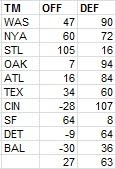
The two teams that jump off the page for me are the Tigers and the Giants. All season I had a good time snarking at the expense of those wild-eyed dreamers who thought that Detroit might have a chance at scoring 1000 runs, and in fact the Tigers were below the AL average in R/G after adjusting for park. It would have seemed difficult to believe two years ago that San Francisco would win another World Series but do it with the offense contributing more than the defense.
* The Mets factoids provide a great segue into discussing Citi Field’s park factor. When significant changes are made to a park, my usual course of action is to treat it as a brand new park. This is not an entirely satisfactory solution, but neither is regressing a park to 1.00 as my methodology also does. One could attempt to develop a hypothetical mean for a park, considering factors such as dimensions, altitude, temperature, knowledge about how the park played before alterations, and other factors. My approach keeps it simple, but not necessarily more accurate--deal only with the park under its current dimensions, use a maximum of five years of data in whichever direction (past or future) that you can grab it from (although 2012 park factors are necessarily 100% based on past experience at this point), and regress heavily.
Considering only 2012, I have Citi Field’s park factor as .96 for runs and 1.02 for home runs. If instead I’d used all four years of available data (2009-2012), it would have been .96 and .95. In this case, regardless of how I figured the park factor, it wouldn’t have made any difference for Mets players.
* NL relief leaders in strikeout rate:

Kimbrel and Chapman are in video game territory, but the most surprising name to me is Jason Grilli.
What I list as KG and WG are strikeouts and walks per plate appearance, scaled to the league average of plate appearances per game. I’ve always advocated looking at strikeout and walk rates per PA rather than per inning, and am happy to see that PA-denominated rates have gained a lot of traction in stathead circles (if you think I’m implying causation between the two causes of this sentence, I’m not). Why have I chosen to scale them to PA-games rather than just leaving them as per PA proportions or percentages?
For the same reason I express batter’s RC rates as per 25.5 outs rather than per out--I have a much better feel for the per game scale, and since it’s only a scalar multiplication, there’s no harm done in terms of the ability to make comparisons . Using the actual league average of PA/G can admittedly create some odd results that don't occur when using outs/game. Outs/game are generally fixed across leagues, but PA/G can vary significantly across contexts. The same is true for K/9. If K/PA is constant between two entities, K/9 will be higher for the entity with a higher average of PA/G (this is the biggest reason I dislike K/9). So the KG figures I report will rank an AL pitcher with the same K/PA ahead of a comparable NL pitcher.
I don’t really consider this a problem, since I’d recommend using adjusted statistics when comparing across leagues anyway. But I can see why for some might find that objectionable for a single season; perhaps next year I’ll use the major league average PA/G to set the scale.
* I am easily amused by teams whose estimated W%s are roughly equal and pitchers whose various run averages are similar. A great example of the latter this year was Josh Johnson. Johnson’s RA was 3.95 and his bullpen support was pretty average, so his RRA was just a touch lower at 3.90. He didn’t allow many unearned runs, so his 3.81 ERA was pretty close to his actual RA. His eRA was 3.81, so his peripheral statistics were in line with his actual RA. And his dRA was 3.90 thanks to his .304 %H being right in line with the NL average of .303.
* Remember when Aaron Cook was a nightmare for sabermetrics? The trashiest site in sports media was all over that case, but in the end, not only was Cook unable to sustain success with a 1.9 KG (and who could have ever forseen that?), his .295 %H was indistinguishable from the AL’s .296 average. And his 5.89 dRA was equal to his 5.89 RRA. Aaron Cook 2012 could be the DIPS poster child.
Speaking of former DIPS debunkers, how did JA Happ manage to get his strikeout rate up to 8.6?
* Major league pitchers with 15 or more starts who averaged at least 100 pitches/start (treating stray relief appearances as half a start): Homer Bailey, Clay Buchholz, Madison Bumgarner, Matt Cain, Johnny Cueto, Yu Darvish, RA Dickey, Yovani Gallardo, Dillon Gee, Gio Gonzalez, Miguel Gonzalez, Cole Hamels, Aaron Harang, Matt Harrison, Felix Hernandez, Phil Hughes, Ubaldo Jimenez, Josh Johnson, Ian Kennedy, Clayton Kershaw, Cliff Lee, Tim Lincecum, Justin Masterson, Jon Niese, Jake Peavy, David Price, CC Sabathia, Chris Sale, Max Scherzer, Jamie Shields, Jason Vargas, Justin Verlander, Edinson Volquez, CJ Wilson.
You are more than free to quibble on this, but the name that really jumps out to me on that list is Dillon Gee. I would argue that the other pitchers on the list pitched very well in 2012 (even if that was a surprise, as in the case of Miguel Gonzalez) or had a reputation (like veteran workhorse Aaron Harang or whatever-the-heck-he-is Ubaldo Jimenez). And Gee only made 17 starts, so his workload was not comparable to the pitchers who were in the rotation all year. Still, Gee was -8 RAA in 2012 and -13 in 2011.
His teammate Jon Niese may have caught your eye as well, but what’s really interesting is that both Gee (103 pitches/start) and Niese (101) actually threw more pitchers per start than their knuckleball and Cy Young contender teammate RA Dickey (100).
* There have been a number of trades in recent years which have involved trading an established starting pitcher for a package that includes a young major league or very advanced starting pitching prospect, only to see the latter outperform the former. Sometimes the superior performance has only been for one season, and either the jury is still out on which guy ultimately is more effective or a second season has given a mixed results (examples include Daniel Hudson/Edwin Jackson, Clayton Richard/Jake Peavy, Jarrod Parker/Trevor Cahill). One of the funniest (and the most personal for me) is the Ubaldo Jimenez trade. I was vehemently opposed to this trade from Cleveland’s perspective when it went down. What happened this year was that all three pitchers involved in the trade were ineffective, but that still is a big win for Colorado when you consider the contract status of all involved:
![]()
The Indians pitching in general was awful. I wrote a little bit above about the horrible starting pitching of Colorado and Minnesota, but Cleveland was right behind. The Indians 5.64 IP/S trailed only those two and Kansas City, their 45 QS% was sixth-lowest in MLB, and their 5.65 starters eRA trailed only the terrible two as well (fourth-worst was the Royals, again, but with a relatively Verlanderesque 5.29). Cleveland allowed 5.58 runs/game on the road, worst in the majors (Houston was next at 5.42; Minnesota next in the AL all the way down at 5.12). Not that they were much better at home--4.85 RA/G was the fourth-most (Colorado was worst, of course, with 6.46).
Their starting pitchers were every bit as dreadful individually as the team totals would indicate:

At least two were above replacement level. 77 primarily AL pitchers made 15 or more starts, and in terms of RAR, the Indians boasted six of the bottom nineteen. Obviously Manny Acta’s fault.
* Adam Dunn hit .204 this year, which was a bit of a disappointment to me. Throughout the season, I was hoping that his final average would slip below the arbitrary Mendoza line in order to have a legitimately solid batting season at that BA level to point too (Dunn was +12 HRAA). It is a bit of consolation that his park-adjusted BA is .199, and that his .445 secondary averaged led all AL hitters with 400+ PA (Jose Bautista and David Ortiz each had a higher SEC and were close to that cutoff). Dunn also came tantalizingly close to breaking the strikeout record, but his 222 fell one short of Mark Reynolds’ 2009 total.
* Bryan LaHair and Anthony Rizzo have obviously had very different pasts and likely will have very different futures. But in 2012, they were statistically about as close as you could ever hope to see from two guys at the same position on the same team:
![]()
The only appreciable difference is in the shape of production, with Rizzo posting a higher BA and LaHair a higher SEC.
* Another fun first base pair is erstwhile division rivals Mark Teixeira and Adrian Gonzalez:
![]()
The differences here are more marked, thanks to a bigger gap in shape of performance and Gonzalez’s extra 166 PA. The collapse of Gonzalez’s secondary contributions was well documented during the season, and I have no insight to offer regarding the cause. Since Gonzalez became a full-time player in 2006, his annual raw secondary averages have been:
.247, .288, .320, .351, .489, .371, .327, .231
If Ned Colletti knew what secondary average was, he might be concerned.
* Here is a pair of veteran teammates:
![]()
Looking at just their offensive contributions, you can see that they were equally effective when in the lineup, albeit with a shape difference (player A had a superior BA, player B a superior SEC). Obviously Player A was in the lineup every day, while Player B missed some time. It isn’t reflected here, but Player A also “played” a tougher fielding position. All told, though, there appears to be little good reason why Player A is still celebrated and Player B is reviled. Don’t overthink this one--you know who they are.
Subscribe to:
Posts (Atom)