I always start this post by looking at team records in blowout and non-blowout games. I define blowouts as games in which the margin of victory is six runs or more (rather than five, the definition used by Baseball-Reference). I settled on this last year after a Twitter discussion with Tom Tango and a poll that he ran. This definition results in 19.4% of major league games in 2018 being classified as blowouts; using five as the cutoff, it would be 28.0%, and using seven it would be 13.2%. Of course, using one standard ignores a number of factors, like the underlying run environment (the higher the run scoring level, the less impressive a fixed margin of victory) and park effects (which have a similar impact but in a more dramatic way when comparing teams in the same season). For the purposes here, around a fifth of games being blowouts feels right; it’s worth monitoring each season to see if the resulting percentage still makes sense.
Team records in non-blowouts:

With over 80% of major league games being non-blowouts (as we’ll see in a moment, the highest blowout % for any team was 26% for Cleveland), it’s no surprise that all of the playoff teams were above .500 in these games, although the Indians and Dodgers just barely so. The Dodgers compensated in a big way:

There was very little middle ground in blowout games, with just three teams having a W% between .400 - .500. This isn’t too surprising since strong teams usually perform very well in blowouts, and the bifurcated nature of team strength in 2018 has been much discussed. This also shows up when looking at each team’s percentage of blowouts and difference between blowout and non-blowout W%:

A more interesting way to consider game-level data is to look at how teams perform when scoring or allowing a given number of runs. For the majors as a whole, here are the counts of games in which teams scored X runs:
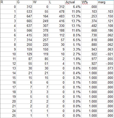
The “marg” column shows the marginal W% for each additional run scored. In 2018, three was the mode of runs scored, while the second run resulted in the largest marginal increase in W%. The distribution is fairly similar to 2017, with the most obvious difference being an increase in W% in one-run games from .057 to .103; not surprisingly, the proportion of shutouts increased as well, from 5.4% to 6.4%.
The major league average dipped from 4.65 to 4.44 runs/game; this is the run distribution anticipated by Enby for that level (actually, 4.45) of R/G for fifteen or fewer runs:

Shutouts ran almost 1% above Enby’s estimated; that stands out in graph form along with Enby’s compensation by over-estimating the frequency of 2 and 3 run games. Still, a zero-modified negative binomial distribution (which is what the distribution I call Enby is) does a decent job:

One way that you can use Enby to examine team performance is to use the team’s actual runs scored/allowed distributions in conjunction with Enby to come up with an offensive or defensive winning percentage. The notion of an offensive winning percentage was first proposed by Bill James as an offensive rate stat that incorporated the win value of runs. An offensive winning percentage is just the estimated winning percentage for an entity based on their runs scored and assuming a league average number of runs allowed. While later sabermetricians have rejected restating individual offensive performance as if the player were his own team, the concept is still sound for evaluating team offense (or, flipping the perspective, team defense).
In 1986, James sketched out how one could use data regarding the percentage of the time that a team wins when scoring X runs to develop an offensive W% for a team using their run distribution rather than average runs scored as used in his standard OW%. I’ve been applying that concept since I’ve written this annual post, and last year was finally able to implement an Enby-based version. I will point you to last year’s post if you are interested in the details of how this is calculated, but there are two main advantages to using Enby rather than the empirical distribution:
1. While Enby may not perfectly match how runs are distributed in the majors, it sidesteps sample size issues and data oddities that are inherent when using empirical data. Use just one year of data and you will see things like teams that score ten runs winning less frequently than teams that score nine. Use multiple years to try to smooth it out and you will no longer be centered at the scoring level for the season you’re examining.
2. There’s no way to park adjust unless you use a theoretical distribution. These are now park-adjusted by using a different assumed distribution of runs allowed given a league-average RA/G for each team based on their park factor (when calculating OW%; for DW%, the adjustment is to the league-average R/G).
I call these measures Game OW% and Game DW% (gOW% and gDW%). One thing to note about the way I did this, with park factors applied on a team-by-team basis and rounding park-adjusted R/G or RA/G to the nearest .05 to use the table of Enby parameters that I’ve calculated, is that the league averages don’t balance to .500 as they should in theory. The average gOW% is .495 and the average gDW% is .505.
For most teams, gOW% and OW% are very similar. Teams whose gOW% is higher than OW% distributed their runs more efficiently (at least to the extent that the methodology captures reality); the reverse is true for teams with gOW% lower than OW%. The teams that had differences of +/- 2 wins between the two metrics were (all of these are the g-type less the regular estimate, with the teams in descending order of absolute value of the difference):
Positive: None
Negative: LA, WAS, CHN, NYN, CLE, LAA, HOU
It doesn’t help here that the league average is .495, but it’s also possible that team-level deviations from Enby are greater given the unusual distribution of offensive events (e.g. low BA, high K, high HR) that currently dominates in MLB. One of the areas I’d like to study given the time and a coherent approach to the problem is how Enby parameters may vary based on component offensive statistics. The Enby parameters are driven by the variance of runs per game and the frequency of shutouts; for both, it’s not too difficult to imagine changes in the shape of offense having a significant impact.
Teams with differences of +/- 2 wins (note: this calculation uses 162 games for all teams even though a handful played 161 or 163 in 2018) between gDW% and standard DW%:
Positive: MIA, PHI, PIT, NYN, CHA
Negative: HOU
Miami’s gDW% was .443 while their DW% was .406, a difference of 5.9 wins which was the highest in the majors for either side of the ball (their offense displayed no such difference, with .449/.444). That makes them a good example to demonstrate what having an unusual run distribution relative to Enby looks like and how that can change the expected wins:

This graph excludes two games in which the Marlins coughed up 18 and 20 runs, which themselves do much to explain the huge discrepancy--giving up twenty runs kills your RA/G but from a win perspective is scarcely different then giving up thirteen (given their run environment, Enby expected that Miami would win 1.1% of the time scoring thirteen and 0.0% allowing twenty).
Miami allowed two and three runs much less frequently than Enby expected; given that they should have won 79% of games when allowing two and 59% when allowing three that explains much of the difference. They allowed eight or more runs 23.6% of the time compared to just 12.5% estimated by Enby, but all those extra runs weren’t particularly costly in terms of wins since the Marlins were only expected to win 6.4% of such games (calculated by taking the weighted average of the expected W% when allowing 8, 9, … runs with the expected frequency of allowing 8, 9, … runs given that they allowed 8+ runs).
I don’t have a good clean process for combining gOW% and gDW% into an overall gEW%; instead I use Pythagenpat math to convert the gOW% and gDW% into equivalent runs and runs allowed and calculate an EW% from those. This can be compared to EW% figured using Pythagenpat with the average runs scored and allowed for a similar comparison of teams with positive and negative differences between the two approaches:
Positive: MIA, PHI, KC, PIT, CHA, MIN, SF, SD
Negative: LA, WAS, HOU, CHN, CLE, LAA, BOS, ATL
Despite their huge defensive difference, Miami was edged out for the largest absolute value of difference by the Dodgers (6.08 to -6.11). The Dodgers were -4.8 on offense and -1.7 on defense (astute readers will note these don’t sum to -6.11, but they shouldn’t given the nature of the math), while the Marlins 5.9 on defense was only buffeted by .9 on offense (as we’ve seen before, there was only a .005 discrepancy between their gOW% and OW%).
The table below has the various winning percentages for each team:

Saturday, January 19, 2019
Run Distribution and W%, 2018
Subscribe to:
Posts (Atom)