Crude Team Rating (CTR) is my name for a simple methodology of ranking teams based on their win ratio (or estimated win ratio) and their opponents’ win ratios. A full explanation of the methodology is here, but briefly:
1) Start with a win ratio figure for each team. It could be actual win ratio, or an estimated win ratio.
2) Figure the average win ratio of the team’s opponents.
3) Adjust for strength of schedule, resulting in a new set of ratings.
4) Begin the process again. Repeat until the ratings stabilize.
The resulting rating, CTR, is an adjusted win/loss ratio rescaled so that the majors’ arithmetic average is 100. The ratings can be used to directly estimate W% against a given opponent (without home field advantage for either side); a team with a CTR of 120 should win 60% of games against a team with a CTR of 80 (120/(120 + 80)).
First, CTR based on actual wins and losses. In the table, “aW%” is the winning percentage equivalent implied by the CTR and “SOS” is the measure of strength of schedule--the average CTR of a team’s opponents. The rank columns provide each team’s rank in CTR and SOS:

The ten playoff teams almost occupied the top ten spots, Cleveland just barely edging out Milwaukee.
I’ve switched how I aggregate for division/league ratings over time, but I think I’ve settled on the right approach, which is just to take the average aW% for each:

It was finally the NL’s year to top the AL, with the latter dragged down by the three worst teams, including Detroit which I believe turned in the lowest CTR since I’ve been calculating these. Amazingly, the AL Central was actually better than in 2019, increasing their average aW% from .431. This was because the Indians were slightly better in 2019 (116 to 113 CTR), the Twins shot from 85 to 140, and the White Sox graduated from horrible to merely bad (58 to 74).
The CTRs can also use theoretical win ratios as a basis, and so the next three tables will be presented without much comment. The first uses gEW%, which is a measure I calculate that looks at each team’s runs scored distribution and runs allowed distribution separately to calculate an expected winning percentage given average runs allowed or runs scored, and then uses Pythagorean logic to combine the two and produce a single estimated W% based on the empirical run distribution:

Next EW% based on R and RA:

And PW% based on RC and RCA:

The final set of ratings is based on actual wins and losses, but includes the playoffs. I am not crazy about this view; while it goes without saying that playoff games provide additional data regarding the quality of teams, I believe that the playoff format biases the ratings against teams that lose in the playoffs, particularly in series that end well before the maximum number of games. It’s not that losing three straight games in a division series shouldn’t hurt a team’s rating, it’s that terminating the series after three games and not playing out the remaining creates bias. Imagine what would happen to CTRs based on regular season games if a team’s regular season terminated when they fell ten games out of a playoff spot. Do you think this would increase the variance in team ratings? The difference between the playoffs and regular season on this front is that the length of the regular season is independent of team performance, but the length of the playoffs is not.
My position is not that the playoffs should be ignored altogether, but I don’t have a satisfactory suggestion on how to correct the playoff-inclusive ratings for this bias without injecting a tremendous amount of my own subjective approach into the mix (one idea would be to add in the expected performance over the remaining games of the series based on the odds implied from the regular season CTRs, but of course this is begging the question to a degree). So I present here the ratings including playoff performance, with each team’s regular season actual CTR and the difference between the two:

Monday, December 23, 2019
Crude Team Ratings, 2019
Friday, December 13, 2019
Hitting by Position, 2019
The first obvious thing to look at is the positional totals for 2018, with the data coming from Baseball-Reference.com. "MLB” is the overall total for MLB, which is not the same as the sum of all the positions here, as pinch-hitters and runners are not included in those. “POS” is the MLB totals minus the pitcher totals, yielding the composite performance by non-pitchers. “PADJ” is the position adjustment, which is the position RG divided by the total for all positions, including pitchers (but excluding pinch hitters). “LPADJ” is the long-term positional adjustment that I am now using, based on 2010-2019 data (see more below). The rows “79” and “3D” are the combined corner outfield and 1B/DH totals, respectively:

There’s nothing too surprising here, although third basemen continue to hit above their historical norm and corner outfielders outhit 1B/DH ever so slightly.
All team figures from this point forward in the post are park-adjusted. The RAA figures for each position are baselined against the overall major league average RG for the position, except for left field and right field which are pooled. NL pitching staffs by RAA (note that the runs created formula I use doesn’t account for sacrifice hits, which matters more when looking at pitcher’s offensive performance than any other breakout you can imagine):

This range is a tad narrower than the norm which is around +/- 20 runs; no teams cost themselves a full win at the plate. This is the second year in a row in which this is the case; of course as innings pitched by starters decline, the number of plate appearances for pitchers does as well.
The teams with the highest RAA at each position were:
C—SEA, 1B—NYN, 2B—MIL, 3B—WAS, SS—HOU, LF—WAS, CF—LAA, RF—MIL
Usually the leaders are pretty self-explanatory, although I did a double-take on Seattle catchers (led by Omar Narvaez with a quietly excellent 260 plate appearances from Tom Murphy) and Milwaukee second basemen (combination of Keston Hiura and Mike Moustakas). I always find the list of positional trailers more interesting (the player listed is the one who started the most games at that position; they usually are not solely to blame for the debacle ):

Four teams hogged eight spots to themselves, kindly leaving one leftover for another AL Central bottom feeder. Moustakas featured prominently in Milwaukee’s successful second base and dreadful third base performances, but unfortunately Travis Shaw was much more responsible for the latter (503 OPS in 66 games! against Moustakas’ solid 815 in 101 games). Also deserving of a special shoutout for his contributions to the two moribund White Sox positions is Daniel Palka, who was only 0-7 as a DH but had a 421 OPS in 78 PA as a right fielder. His total line for the season was 372 OPS in 93 PA; attending a September White Sox/Indians series, it was hard to take one’s eyes off his batting line of the scoreboard (his pre-September line was .022/.135/.022 in 52 PA).
The next table shows the correlation (r) between each team’s RG for each position (excluding pitchers) and the long-term position adjustment (using pooled 1B/DH and LF/RF). A high correlation indicates that a team’s offense tended to come from positions that you would expect it to:

The following tables, broken out by division, display RAA for each position, with teams sorted by the sum of positional RAA. Positions with negative RAA are in red, and positions that are +/-20 RAA are bolded:


A few observations:
* The Tigers were below-average at every position; much could (and has) been written about Detroit’s historic lack of even average offensive players, but a positional best of -9 kind of sums it up
* The Indians had only one average offensive position, which was surprising to me as I would have thought that even while not having his best season, Franciso Lindor would have salvaged shortstop (he had 17 RAA personally). Non-Lindor Indian shortstops had only 92 PA, but they hit .123/.259/.173 (unadjusted).
* That -30 at third base for the Angels, wonder what they’ll do to address that
* Houston had 109 infield RAA, the next closest team was the Dodgers with 73. The Dodgers had the best outfield RAA with 77; the Astros were fifth with 46.
Finally, I alluded to an update to the long-term positional adjustments I use above. You can see my end of season stats post for some discussion about why I use offensive positional adjustments in my RAR estimates. A quick summary of my thinking:
* There are a lot of different RAR/WAR estimates available now. If I can offer a somewhat valid but unique perspective, I think that adds more value than a watered down version of the same thing everyone else is publishing.
* When possible, I like to publish metrics that I have had some role in developing (please note, I’m not saying that any of them are my own ideas, just that it’s nice to be able to develop your own version of a pre-existing concept). I don’t publish my own defensive metrics and while defensive positional adjustments are based on more than simply player’s comparative performance across positions using fielding metrics, they are basic starting point for that type of analysis.
* While I do not claim that the relationship is or should be perfect, at the level of talent filtering that exists to select major leaguers, there should be an inverse relationship between offensive performance by position and the defensive responsibilities of the position. Not a perfect one, but a relationship nonetheless. An offensive positional adjustment than allows for a more objective approach to setting a position adjustment. Again, I have to clarify that I don’t think subjectivity in metric design is a bad thing - any metric, unless it’s simply expressing some fundamental baseball quantity or rate (e.g. “home runs” or “on base average”) is going to involve some subjectivity in design (e.g linear or multiplicative run estimator, any myriad of different ways to design park factors, whether to include a category like sacrifice flies that is more teammate-dependent)
I use the latest ten years of data for the majors (2010 – 2019), which should smooth out some of the randomness in positional performance. Than I simply calculate RG for each position and divide by the league average of positional performance (i.e. excluding pinch-hitters and pinch-runners). I then pool 1B/DH and LF/RF. Only looking at positional performance is necessary because the goal is not to express the position average relative to the league, but rather to the other positions for the purpose of determining their relative performance. If pinch-hitters perform worse than position players, I don’t want them to bring down the league average and thus raise the offensive positional adjustment, because pinch-hitters will not be subject to the offensive positional adjustment when calculating their RAR. (I suppose if you were so inclined, you could include them, and use that as your backdoor way of accounting for the pinch-hitting penalty in a metric, but I assign each player to a primary position (or some weighted average of their defensive positions) and so this wouldn’t really make sense, and would result in positional adjustments that are too high when they are applied to the league average RG.
For 2010-2019, the resulting PADJs are:

Wednesday, December 04, 2019
Leadoff Hitters, 2019
In the past I’ve wasted time writing in a structured format, instead of just explaining how the metrics are calculated and noting anything that stands out to me. I’m opting for the latter approach this year, both in this piece and in other “end of season” statistics summaries.
I’ve always been interested in leadoff hitter performance, despite not being particularly not claiming that it held any particular significance beyond the obvious. The linked spreadsheet includes a number of metrics, and there are three very important caveats:
1. The data from Baseball-Reference and includes the performance of anyone who hit in the leadoff spot during a game. I’ve included the names and number of games starting at leadoff for all players with twenty or more starts.
2. Many of the metrics shown are descriptive, not quality metrics
3. None of this is park-adjusted
The metrics shown in the spreadsheet are:
* Runs Scored per 25.5 outs = R*25.5/(AB – H + CS)
Runs scored are obviously influenced heavily by the team, but it’s a natural starting point when looking at leadoff hitters.
* On Base Average (OBA) = (H + W + HB)/(AB + W + HB)
If you need this explained, you’re reading the wrong blog.
* Runners On Base Average (ROBA) = (H + W + HB – HR – CS)/(AB + W + HB)
This is not a quality metric, but it is useful when thinking about the run scoring process as it’s essentially a rate for the Base Runs “A” component, depending on how you choose to handle CS in your BsR variation. It is the rate at which a hitter is on base for a teammate to advance.
* “Literal” On Base Average (LOBA) = (H + W + HB – HR – CS)/(AB + W + HB – HR)
This is a metric I’ve made up for this series that I don’t actually consider of any value; it is the same as ROBA except it doesn’t “penalize” homers by counting them in the denominator. I threw scare quotes around “penalize” because I don’t think ROBA penalizes homers; rather it recognizes that homers do not result in runners on base. It’s only a “penalty” if you misuse the metric.
* R/RBI Ratio (R/BI) = R/RBI
A very crude way of measuring the shape of a hitter’s performance, with much contextual bias.
* Run Element Ratio (RER) = (W + SB)/(TB – H)
This is an old Bill James shape metric which is a ratio between events that tend to be more valuable at the start of an inning to events that tend to be more valuable at the end of an inning. As such, leadoff hitters historically have tended to have high RERs, although recently they have just barely exceeded the league average as is the case here. Leadoff hitters were also just below the league average in Isolated Power (.180 to .183) and HR/PA (.035 to .037)
* Net Stolen Bases (NSB) = SB – 2*CS
A crude way to weight SB and CS, not perfectly reflecting the run value difference between the two
* 2OPS = 2*OBA + SLG
This is a metric that David Smyth suggested for measuring leadoff hitters, just an OPS variant that uses a higher weight for OBA than would be suggested by maximizing correlation to runs scored (which would be around 1.8). Of course, 2OPS is still closer to ideal than the widely-used OPS, albeit with the opposite bias.
* Runs Created per Game – see End of Season Statistics post for calculation
This is the basic measure I would use to evaluate a hitter’s rate performance.
* Leadoff Efficiency – This is a theoretical measure of linear weights runs above average per 756 PA, assuming that every plate appearance occurred in the quintessential leadoff situation of no runners on, none out. 756 PA is the aveage PA/team for the leadoff spot this season. See this post for a full explanation of the formula; the 2019 out & CS coefficients are -.231 and -.598 respectively.
A couple things that jumped out at me:
* Only six teams had just one player with twenty or more starts as a leadoff man. Tampa Bay was one of those teams; Austin Meadows led off 53 times, while six other players lead off (this feels like it should be one word) between ten and twenty times.
* Chicago was devoid of quality leadoff performance in either circuit, but the Cubs OBA woes really stand out; at .296, they were fourteen points worse than the next-closest team, which amazingly enough was the champion of their divison. The opposite was true in Texas, where the two best teams in OBA reside.
See the link below for the spreadsheet; if you change the end of the URL from “HTML” to “XLSX”, you can download an Excel version:
2019 Leadoff Hitters
Monday, November 11, 2019
Hypothetical Award Ballots, 2019
In the past I’ve split these up into three separate posts, but it’s dawned on me that maybe if combined they will be long enough to actually merit a post. I should note that this is something I write not because I think anyone will be interested in, but because I enjoy having a record of what I thought about these things years later. In reviewing some of those posts from prior years, I’ve concluded that they had way too many numbers in an attempt to justify every ballot spot. I publish the RAR figures that are the starting point for any retrospective player valuation exercise I engage in -- I no longer see a need to regurgitate them all unless it’s important to a point.
AL ROY:
1. DH Yordan Alvarez, HOU
2. SP John Means, BAL
3. SP Zach Plesac, CLE
4. 2B Brandon Lowe, TB
5. 2B Cavan Biggio, TOR
Alvarez is an easy choice – while he only had 367 PA, the only AL hitter with a better RG was Mike Trout. The only real competition is John Means, who turned in a fine season pitching for Baltimore, although his peripherals were far less impressive than his actual results, which was also true for Zach Plesac. I slid Brandon Lowe just ahead of Cavan Biggio on the basis of fielding, which is also why they got the nod over Eloy Jimenez and Luis Arraez.
NL ROY:
1. 1B Pete Alonso, NYN
2. SP Mike Soroka, ATL
3. SS Fernando Tatis, SD
4. LF Bryan Reynolds, PIT
5. SP Chris Paddack, SD
Any of the first three would top my AL ballot. On a pure RAR basis, Soroka would edge out Alonso, but Soroka’s peripherals were not as strong as his actual runs allowed which drops him a bit. It’s worth noting that on a rate basis Fernando Tatis was better than Alonso -- he had 40 RAR in 84 games, which over a 150 game season would have put him squarely in the MVP race. Of course, he was unlikely to have kept up that pace, and his underlying performance may not have been the equals of those numbers. But on the other hand, he is four years younger than Alonso and much more likely to be a long-term star. Bryan Reynolds had a quietly good season, but there were other strong position player candidates including Keston Hiura, Kevin Newman, Tommy Edman, and Christian Walker, any of whom would have edged out the second basemen on my AL ballot. The same is also true of pitchers -- I went with Chris Paddack over Sandy Alcantara, Dakota Hudson, and Zac Gallen. Gallen was brilliant over 80 innings (2.63 RRA with lesser but still strong peripherals like a 3.70 dRA), but it’s not enough when Paddack tossed 140 innings with 10.6 K/2.1 W per game.
AL Cy Young:
1. Justin Verlander, HOU
2. Gerrit Cole, HOU
3. Shane Bieber, CLE
4. Lance Lynn, TEX
5. Charlie Morton, TB
I expect Cole to win, but my vote would go to Verlander. Verlander threw ten more innings with a better RRA and the same eRA, although Cole does better in dRA as Verlander’s BABIP was low (.226 to Cole’s .279). I give that some weight, but not enough to overcome Verlander’s lead, and one could argue that Verlander’s high home run rate should offset his low BABIP when making adjustments for peripherals. Sam Miller pointed out on Effectively Wild that Verlander has had a disproportionate number of second-place finishes in Cy voting. I concur, and while none of them were cases in which the actual choice was a poor one, for my money Verlander was the AL’s top pitcher in 2011, 2012, 2016, 2018, and 2019. Mike Minor’s high dRA knocked him off my ballot in favor of teammate Lance Lynn and Charlie Morton.
NY Cy Young:
1. Jacob deGrom, NYN
2. Stephen Strasburg, WAS
3. Max Scherzer, WAS
4. Jack Flaherty, STL
5. Hyun-Jin Ryu, LA
deGrom was an easy choice for the top of the ballot, but after that I used a fair amount of judgment. Strasburg had the most consistent RAR figures, whether using RRA, eRA, or dRA; Flaherty and Ryu both had significantly worse dRAs, which dropped them behind the Nationals on my ballot. There also should be some recognition of Zack Greinke; had he spent his entire season in the NL he would have ranked second here, but if it’s an NL award I don’t think AL performance should get any credit, and so he doesn’t rank in the top five.
AL MVP:
1. CF Mike Trout, LAA
2. 3B Alex Bregman, HOU
3. SP Justin Verlander, HOU
4. SP Gerrit Cole, HOU
5. SP Shane Bieber, CLE
6. SP Lance Lynn, TEX
7. SP Charlie Morton, TB
8. SS Marcus Semien, OAK
9. SP Mike Minor, TEX
10. CF George Springer, HOU
Had Mike Trout not been sidelined by a foot issue in September, this wouldn’t even be a question. I still think Trout is the clear (if not inarguable) choice; he starts ahead of Bregman by just a single run in RAR, and if you give full credit to fielding metrics, Bregman could be ahead as Trout’s BP/UZR/DRS fielding runs saved were (7, -1, -1) compared to Bregman’s (11, 2, 7). However, I only give half-credit as the uncertainty regarding fielding performance means an estimated fielding run saved is not as conclusive of value as an estimated offensive run contributed. The other major area of the game not taken into account in my RAR estimates is baserunning, and using BP’s figures, Trout was +3 runs and Bregman -4 (removing basestealing runs, which I already take into account). That wipes out any advantage Bregman might have in the field, and all things being equal I would take the player who contributes equal RAR in less playing time - just because I think that if I’ve erred in setting replacement level, I’ve erred by setting it too low. The slotting of position players otherwise follows RAR except that Xander Bogaerts had dreadful fielding metrics (-21, 1, -21) which knocks him out.
If you just look at RAR, Verlander could rank ahead of either of the hitters, but while I have absolutely no problem supporting a pitcher as MVP, I do think in such a case that they should have better RAR not just when using their actual runs allowed, but using peripherals as well. Verlander has 91, 83, or 64 RAR depending on the inputs you use; I have Trout as 80 when considering fielding and baserunning, and that sixteen run gap using Verlander’s dRA is too large for me to put him on top.
I’ve never put six pitchers on a hypothetical MVP ballot before, and as you’ll see with the NL, a full half of my MVP ballot spots went to pitchers. One thing I should revisit is the replacement level I’m using for starters, which is 128% of the league average RA; I had previously used 125%, and with the continual decline in the share of innings borne by starters and the 2019 development that starters had a better overall eRA than relievers, it’s worth revisiting the replacement level I’m using for starters and considering adjusting it downward.
NL MVP:
1. CF Cody Bellinger, LA
2. RF Christian Yelich, MIL
3. SP Jacob deGrom, NYN
4. 3B Anthony Rendon, WAS
5. SP Stephen Strasburg, WAS
6. SP Max Scherzer, WAS
7. 1B Pete Alonso, NYN
8. CF Ronald Acuna, ATL
9. LF Juan Soto, WAS
10. SP Jack Flaherty, STL
Bellinger and Yelich were very close in RAR, but this is a case where fielding gives Bellinger (15, 10, 19) a clear edge over Yelich (-1, 0, -3). That’s pretty much the only place that needs explanation beyond just perusing the RAR figures, except that Starling Marte’s (-12, -1, -1) fielding puts him behind the young outfielders of the AL East.
Friday, October 04, 2019
End of Season Statistics, 2019
The spreadsheets are published as Google Spreadsheets, which you can download in Excel format by changing the extension in the address from "=html" to "=xlsx", or in open format as "=ods". That way you can download them and manipulate things however you see fit.
The data comes from a number of different sources. Most of the data comes from Baseball-Reference. KJOK's park database is extremely helpful in determining when park factors should reset.
The basic philosophy behind these stats is to use the simplest methods that have acceptable accuracy. Of course, "acceptable" is in the eye of the beholder, namely me. I use Pythagenpat not because other run/win converters, like a constant RPW or a fixed exponent are not accurate enough for this purpose, but because it's mine and it would be kind of odd if I didn't use it.
If I seem to be a stickler for purity in my critiques of others' methods, I'd contend it is usually in a theoretical sense, not an input sense. So when I exclude hit batters, I'm not saying that hit batters are worthless or that they *should* be ignored; it's just easier not to mess with them and not that much less accurate (note: hit batters are actually included in the offensive statistics now).
I also don't really have a problem with people using sub-standard methods (say, Basic RC) as long as they acknowledge that they are sub-standard. If someone pretends that Basic RC doesn't undervalue walks or cause problems when applied to extreme individuals, I'll call them on it; if they explain its shortcomings but use it regardless, I accept that. Take these last three paragraphs as my acknowledgment that some of the statistics displayed here have shortcomings as well, and I've at least attempted to describe some of them in the discussion below.
The League spreadsheet is pretty straightforward--it includes league totals and averages for a number of categories, most or all of which are explained at appropriate junctures throughout this piece. The advent of interleague play has created two different sets of league totals--one for the offense of league teams and one for the defense of league teams. Before interleague play, these two were identical. I do not present both sets of totals (you can figure the defensive ones yourself from the team spreadsheet, if you desire), just those for the offenses. The exception is for the defense-specific statistics, like innings pitched and quality starts. The figures for those categories in the league report are for the defenses of the league's teams. However, I do include each league's breakdown of basic pitching stats between starters and relievers (denoted by "s" or "r" prefixes), and so summing those will yield the totals from the pitching side. The one abbreviation you might not recognize is "N"--this is the league average of runs/game for one team, and it will pop up again.
The Team spreadsheet focuses on overall team performance--wins, losses, runs scored, runs allowed. The columns included are: Park Factor (PF), Home Run Park Factor (PFhr), Winning Percentage (W%), Expected W% (EW%), Predicted W% (PW%), wins, losses, runs, runs allowed, Runs Created (RC), Runs Created Allowed (RCA), Home Winning Percentage (HW%), Road Winning Percentage (RW%) [exactly what they sound like--W% at home and on the road], Runs/Game (R/G), Runs Allowed/Game (RA/G), Runs Created/Game (RCG), Runs Created Allowed/Game (RCAG), and Runs Per Game (the average number of runs scored an allowed per game). Ideally, I would use outs as the denominator, but for teams, outs and games are so closely related that I don’t think it’s worth the extra effort.
The runs and Runs Created figures are unadjusted, but the per-game averages are park-adjusted, except for RPG which is also raw. Runs Created and Runs Created Allowed are both based on a simple Base Runs formula. The formula is:
A = H + W - HR - CS
B = (2TB - H - 4HR + .05W + 1.5SB)*.76
C = AB - H
D = HR
Naturally, A*B/(B + C) + D.
I have explained the methodology used to figure the PFs before, but the cliff’s notes version is that they are based on five years of data when applicable, include both runs scored and allowed, and they are regressed towards average (PF = 1), with the amount of regression varying based on the number of years of data used. There are factors for both runs and home runs. The initial PF (not shown) is:
iPF = (H*T/(R*(T - 1) + H) + 1)/2
where H = RPG in home games, R = RPG in road games, T = # teams in league (14 for AL and 16 for NL). Then the iPF is converted to the PF by taking x*iPF + (1-x), where x = .6 if one year of data is used, .7 for 2, .8 for 3, and .9 for 4+.
It is important to note, since there always seems to be confusion about this, that these park factors already incorporate the fact that the average player plays 50% on the road and 50% at home. That is what the adding one and dividing by 2 in the iPF is all about. So if I list Fenway Park with a 1.02 PF, that means that it actually increases RPG by 4%.
In the calculation of the PFs, I did not take out “home” games that were actually at neutral sites (of which there were a rash this year).
There are also Team Offense and Defense spreadsheets. These include the following categories:
Team offense: Plate Appearances, Batting Average (BA), On Base Average (OBA), Slugging Average (SLG), Secondary Average (SEC), Walks and Hit Batters per At Bat (WAB), Isolated Power (SLG - BA), R/G at home (hR/G), and R/G on the road (rR/G) BA, OBA, SLG, WAB, and ISO are park-adjusted by dividing by the square root of park factor (or the equivalent; WAB = (OBA - BA)/(1 - OBA), ISO = SLG - BA, and SEC = WAB + ISO).
Team defense: Innings Pitched, BA, OBA, SLG, Innings per Start (IP/S), Starter's eRA (seRA), Reliever's eRA (reRA), Quality Start Percentage (QS%), RA/G at home (hRA/G), RA/G on the road (rRA/G), Battery Mishap Rate (BMR), Modified Fielding Average (mFA), and Defensive Efficiency Record (DER). BA, OBA, and SLG are park-adjusted by dividing by the square root of PF; seRA and reRA are divided by PF.
The three fielding metrics I've included are limited it only to metrics that a) I can calculate myself and b) are based on the basic available data, not specialized PBP data. The three metrics are explained in this post, but here are quick descriptions of each:
1) BMR--wild pitches and passed balls per 100 baserunners = (WP + PB)/(H + W - HR)*100
2) mFA--fielding average removing strikeouts and assists = (PO - K)/(PO - K + E)
3) DER--the Bill James classic, using only the PA-based estimate of plays made. Based on a suggestion by Terpsfan101, I've tweaked the error coefficient. Plays Made = PA - K - H - W - HR - HB - .64E and DER = PM/(PM + H - HR + .64E)
Next are the individual player reports. I defined a starting pitcher as one with 15 or more starts. All other pitchers are eligible to be included as a reliever. If a pitcher has 40 appearances, then they are included. Additionally, if a pitcher has 50 innings and less than 50% of his appearances are starts, he is also included as a reliever (this allows some swingmen type pitchers who wouldn’t meet either the minimum start or appearance standards to get in). This would be a good point to note that I didn't do much to adjust for the opener--I made some judgment calls (very haphazard judgment calls) on which bucket to throw some pitchers in. This is something that I should definitely give some more thought to in coming years.
For all of the player reports, ages are based on simply subtracting their year of birth from 2019. I realize that this is not compatible with how ages are usually listed and so “Age 27” doesn’t necessarily correspond to age 27 as I list it, but it makes everything a heckuva lot easier, and I am more interested in comparing the ages of the players to their contemporaries than fitting them into historical studies, and for the former application it makes very little difference. The "R" category records rookie status with a "R" for rookies and a blank for everyone else; I've trusted Baseball Prospectus on this. Also, all players are counted as being on the team with whom they played/pitched (IP or PA as appropriate) the most.
For relievers, the categories listed are: Games, Innings Pitched, estimated Plate Appearances (PA), Run Average (RA), Relief Run Average (RRA), Earned Run Average (ERA), Estimated Run Average (eRA), DIPS Run Average (dRA), Strikeouts per Game (KG), Walks per Game (WG), Guess-Future (G-F), Inherited Runners per Game (IR/G), Batting Average on Balls in Play (%H), Runs Above Average (RAA), and Runs Above Replacement (RAR).
IR/G is per relief appearance (G - GS); it is an interesting thing to look at, I think, in lieu of actual leverage data. You can see which closers come in with runners on base, and which are used nearly exclusively to start innings. Of course, you can’t infer too much; there are bad relievers who come in with a lot of people on base, not because they are being used in high leverage situations, but because they are long men being used in low-leverage situations already out of hand.
For starting pitchers, the columns are: Wins, Losses, Innings Pitched, Estimated Plate Appearances (PA), RA, RRA, ERA, eRA, dRA, KG, WG, G-F, %H, Pitches/Start (P/S), Quality Start Percentage (QS%), RAA, and RAR. RA and ERA you know--R*9/IP or ER*9/IP, park-adjusted by dividing by PF. The formulas for eRA and dRA are based on the same Base Runs equation and they estimate RA, not ERA.
* eRA is based on the actual results allowed by the pitcher (hits, doubles, home runs, walks, strikeouts, etc.). It is park-adjusted by dividing by PF.
* dRA is the classic DIPS-style RA, assuming that the pitcher allows a league average %H, and that his hits in play have a league-average S/D/T split. It is park-adjusted by dividing by PF.
The formula for eRA is:
A = H + W - HR
B = (2*TB - H - 4*HR + .05*W)*.78
C = AB - H = K + (3*IP - K)*x (where x is figured as described below for PA estimation and is typically around .93) = PA (from below) - H - W
eRA = (A*B/(B + C) + HR)*9/IP
To figure dRA, you first need the estimate of PA described below. Then you calculate W, K, and HR per PA (call these %W, %K, and %HR). Percentage of balls in play (BIP%) = 1 - %W - %K - %HR. This is used to calculate the DIPS-friendly estimate of %H (H per PA) as e%H = Lg%H*BIP%.
Now everything has a common denominator of PA, so we can plug into Base Runs:
A = e%H + %W
B = (2*(z*e%H + 4*%HR) - e%H - 5*%HR + .05*%W)*.78
C = 1 - e%H - %W - %HR
cRA = (A*B/(B + C) + %HR)/C*a
z is the league average of total bases per non-HR hit (TB - 4*HR)/(H - HR), and a is the league average of (AB - H) per game.
Also shown are strikeout and walk rate, both expressed as per game. By game I mean not nine innings but rather the league average of PA/G. I have always been a proponent of using PA and not IP as the denominator for non-run pitching rates, and now the use of per PA rates is widespread. Usually these are expressed as K/PA and W/PA, or equivalently, percentage of PA with a strikeout or walk. I don’t believe that any site publishes these as K and W per equivalent game as I am here. This is not better than K%--it’s simply applying a scalar multiplier. I like it because it generally follows the same scale as the familiar K/9.
To facilitate this, I’ve finally corrected a flaw in the formula I use to estimate plate appearances for pitchers. Previously, I’ve done it the lazy way by not splitting strikeouts out from other outs. I am now using this formula to estimate PA (where PA = AB + W):
PA = K + (3*IP - K)*x + H + W
Where x = league average of (AB - H - K)/(3*IP - K)
Then KG = K*Lg(PA/G) and WG = W*Lg(PA/G).
G-F is a junk stat, included here out of habit because I've been including it for years. It was intended to give a quick read of a pitcher's expected performance in the next season, based on eRA and strikeout rate. Although the numbers vaguely resemble RAs, it's actually unitless. As a rule of thumb, anything under four is pretty good for a starter. G-F = 4.46 + .095(eRA) - .113(K*9/IP). It is a junk stat. JUNK STAT JUNK STAT JUNK STAT. Got it?
%H is BABIP, more or less--%H = (H - HR)/(PA - HR - K - W), where PA was estimated above. Pitches/Start includes all appearances, so I've counted relief appearances as one-half of a start (P/S = Pitches/(.5*G + .5*GS). QS% is just QS/(G - GS); I don't think it's particularly useful, but Doug's Stats include QS so I include it.
I've used a stat called Relief Run Average (RRA) in the past, based on Sky Andrecheck's article in the August 1999 By the Numbers; that one only used inherited runners, but I've revised it to include bequeathed runners as well, making it equally applicable to starters and relievers. One thing that's become more problematic as time goes on for calculating this expanded metric is the sketchy availability of bequeathed runner data for relievers. As a result, only bequeathed runners left by starters (and "relievers" when pitching as starters) are taken into account here. I use RRA as the building block for baselined value estimates for all pitchers. I explained RRA in this article, but the bottom line formulas are:
BRSV = BRS - BR*i*sqrt(PF)
IRSV = IR*i*sqrt(PF) - IRS
RRA = ((R - (BRSV + IRSV))*9/IP)/PF
The two baselined stats are Runs Above Average (RAA) and Runs Above Replacement (RAR). Starting in 2015 I revised RAA to use a slightly different baseline for starters and relievers as described here. The adjustment is based on patterns from the last several seasons of league average starter and reliever eRA. Thus it does not adjust for any advantages relief pitchers enjoy that are not reflected in their component statistics. This could include runs allowed scoring rules that benefit relievers (although the use of RRA should help even the scales in this regard, at least compared to raw RA) and the talent advantage of starting pitchers. The RAR baselines do attempt to take the latter into account, and so the difference in starter and reliever RAR will be more stark than the difference in RAA.
RAA (relievers) = (.951*LgRA - RRA)*IP/9
RAA (starters) = (1.025*LgRA - RRA)*IP/9
RAR (relievers) = (1.11*LgRA - RRA)*IP/9
RAR (starters) = (1.28*LgRA - RRA)*IP/9
All players with 250 or more plate appearances (official, total plate appearances) are included in the Hitters spreadsheets (along with some players close to the cutoff point who I was interested in). Each is assigned one position, the one at which they appeared in the most games. The statistics presented are: Games played (G), Plate Appearances (PA), Outs (O), Batting Average (BA), On Base Average (OBA), Slugging Average (SLG), Secondary Average (SEC), Runs Created (RC), Runs Created per Game (RG), Speed Score (SS), Hitting Runs Above Average (HRAA), Runs Above Average (RAA), Hitting Runs Above Replacement (HRAR), and Runs Above Replacement (RAR).
Starting in 2015, I'm including hit batters in all related categories for hitters, so PA is now equal to AB + W+ HB. Outs are AB - H + CS. BA and SLG you know, but remember that without SF, OBA is just (H + W + HB)/(AB + W + HB). Secondary Average = (TB - H + W + HB)/AB = SLG - BA + (OBA - BA)/(1 - OBA). I have not included net steals as many people (and Bill James himself) do, but I have included HB which some do not.
BA, OBA, and SLG are park-adjusted by dividing by the square root of PF. This is an approximation, of course, but I'm satisfied that it works well (I plan to post a couple articles on this some time during the offseason). The goal here is to adjust for the win value of offensive events, not to quantify the exact park effect on the given rate. I use the BA/OBA/SLG-based formula to figure SEC, so it is park-adjusted as well.
Runs Created is actually Paul Johnson's ERP, more or less. Ideally, I would use a custom linear weights formula for the given league, but ERP is just so darn simple and close to the mark that it’s hard to pass up. I still use the term “RC” partially as a homage to Bill James (seriously, I really like and respect him even if I’ve said negative things about RC and Win Shares), and also because it is just a good term. I like the thought put in your head when you hear “creating” a run better than “producing”, “manufacturing”, “generating”, etc. to say nothing of names like “equivalent” or “extrapolated” runs. None of that is said to put down the creators of those methods--there just aren’t a lot of good, unique names available.
For 2015, I refined the formula a little bit to:
1. include hit batters at a value equal to that of a walk
2. value intentional walks at just half the value of a regular walk
3. recalibrate the multiplier based on the last ten major league seasons (2005-2014)
This revised RC = (TB + .8H + W + HB - .5IW + .7SB - CS - .3AB)*.310
RC is park adjusted by dividing by PF, making all of the value stats that follow park adjusted as well. RG, the Runs Created per Game rate, is RC/O*25.5. I do not believe that outs are the proper denominator for an individual rate stat, but I also do not believe that the distortions caused are that bad. (I still intend to finish my rate stat series and discuss all of the options in excruciating detail, but alas you’ll have to take my word for it now).
Several years ago I switched from using my own "Speed Unit" to a version of Bill James' Speed Score; of course, Speed Unit was inspired by Speed Score. I only use four of James' categories in figuring Speed Score. I actually like the construct of Speed Unit better as it was based on z-scores in the various categories (and amazingly a couple other sabermetricians did as well), but trying to keep the estimates of standard deviation for each of the categories appropriate was more trouble than it was worth.
Speed Score is the average of four components, which I'll call a, b, c, and d:
a = ((SB + 3)/(SB + CS + 7) - .4)*20
b = sqrt((SB + CS)/(S + W))*14.3
c = ((R - HR)/(H + W - HR) - .1)*25
d = T/(AB - HR - K)*450
James actually uses a sliding scale for the triples component, but it strikes me as needlessly complex and so I've streamlined it. He looks at two years of data, which makes sense for a gauge that is attempting to capture talent and not performance, but using multiple years of data would be contradictory to the guiding principles behind this set of reports (namely, simplicity. Or laziness. You're pick.) I also changed some of his division to mathematically equivalent multiplications.
There are a whopping four categories that compare to a baseline; two for average, two for replacement. Hitting RAA compares to a league average hitter; it is in the vein of Pete Palmer’s Batting Runs. RAA compares to an average hitter at the player’s primary position. Hitting RAR compares to a “replacement level” hitter; RAR compares to a replacement level hitter at the player’s primary position. The formulas are:
HRAA = (RG - N)*O/25.5
RAA = (RG - N*PADJ)*O/25.5
HRAR = (RG - .73*N)*O/25.5
RAR = (RG - .73*N*PADJ)*O/25.5
PADJ is the position adjustment, and it has now been updated to be based on 2010-2019 offensive data. For catchers it is .92; for 1B/DH, 1.14; for 2B, .99; for 3B, 1.07; for SS, .95; for LF/RF, 1.09; and for CF, 1.05. As positional flexibility takes hold, fielding value is better quantified, and the long-term evolution of the game continues, it's right to question whether offensive positional adjustments are even less reflective of what we are trying to account for than they were in the past. I have a general discussion about the use of offensive positional adjustments below that I wrote a decade ago, but I will also have a bit more to say about this and these specific adjustments in my annual post on Hitting by Position which hopefully will actually be published this year.
That was the mechanics of the calculations; now I'll twist myself into knots trying to justify them. If you only care about the how and not the why, stop reading now.
The first thing that should be covered is the philosophical position behind the statistics posted here. They fall on the continuum of ability and value in what I have called "performance". Performance is a technical-sounding way of saying "Whatever arbitrary combination of ability and value I prefer".
With respect to park adjustments, I am not interested in how any particular player is affected, so there is no separate adjustment for lefties and righties for instance. The park factor is an attempt to determine how the park affects run scoring rates, and thus the win value of runs.
I apply the park factor directly to the player's statistics, but it could also be applied to the league context. The advantage to doing it my way is that it allows you to compare the component statistics (like Runs Created or OBA) on a park-adjusted basis. The drawback is that it creates a new theoretical universe, one in which all parks are equal, rather than leaving the player grounded in the actual context in which he played and evaluating how that context (and not the player's statistics) was altered by the park.
The good news is that the two approaches are essentially equivalent; in fact, they are precisely equivalent if you assume that the Runs Per Win factor is equal to the RPG. Suppose that we have a player in an extreme park (PF = 1.15, approximately like Coors Field pre-humidor) who has an 8 RG before adjusting for park, while making 350 outs in a 4.5 N league. The first method of park adjustment, the one I use, converts his value into a neutral park, so his RG is now 8/1.15 = 6.957. We can now compare him directly to the league average:
RAA = (6.957 - 4.5)*350/25.5 = +33.72
The second method would be to adjust the league context. If N = 4.5, then the average player in this park will create 4.5*1.15 = 5.175 runs. Now, to figure RAA, we can use the unadjusted RG of 8:
RAA = (8 - 5.175)*350/25.5 = +38.77
These are not the same, as you can obviously see. The reason for this is that they take place in two different contexts. The first figure is in a 9 RPG (2*4.5) context; the second figure is in a 10.35 RPG (2*4.5*1.15) context. Runs have different values in different contexts; that is why we have RPW converters in the first place. If we convert to WAA (using RPW = RPG, which is only an approximation, so it's usually not as tidy as it appears below), then we have:
WAA = 33.72/9 = +3.75
WAA = 38.77/10.35 = +3.75
Once you convert to wins, the two approaches are equivalent. The other nice thing about the first approach is that once you park-adjust, everyone in the league is in the same context, and you can dispense with the need for converting to wins at all. You still might want to convert to wins, and you'll need to do so if you are comparing the 2015 players to players from other league-seasons (including between the AL and NL in the same year), but if you are only looking to compare Christian Yelich to Matt Carpenter, it's not necessary. WAR is somewhat ubiquitous now, but personally I prefer runs when possible--why mess with decimal points if you don't have to?
The park factors used to adjust player stats here are run-based. Thus, they make no effort to project what a player "would have done" in a neutral park, or account for the difference effects parks have on specific events (walks, home runs, BA) or types of players. They simply account for the difference in run environment that is caused by the park (as best I can measure it). As such, they don't evaluate a player within the actual run context of his team's games; they attempt to restate the player's performance as an equivalent performance in a neutral park.
I suppose I should also justify the use of sqrt(PF) for adjusting component statistics. The classic defense given for this approach relies on basic Runs Created--runs are proportional to OBA*SLG, and OBA*SLG/PF = OBA/sqrt(PF)*SLG/sqrt(PF). While RC may be an antiquated tool, you will find that the square root adjustment is fairly compatible with linear weights or Base Runs as well. I am not going to take the space to demonstrate this claim here, but I will some time in the future.
Many value figures published around the sabersphere adjust for the difference in quality level between the AL and NL. I don't, but this is a thorny area where there is no right or wrong answer as far as I'm concerned. I also do not make an adjustment in the league averages for the fact that the overall NL averages include pitcher batting and the AL does not (not quite true in the era of interleague play, but you get my drift).
The difference between the leagues may not be precisely calculable, and it certainly is not constant, but it is real. If the average player in the AL is better than the average player in the NL, it is perfectly reasonable to expect the average AL player to have more RAR than the average NL player, and that will not happen without some type of adjustment. On the other hand, if you are only interested in evaluating a player relative to his own league, such an adjustment is not necessarily welcome.
The league argument only applies cleanly to metrics baselined to average. Since replacement level compares the given player to a theoretical player that can be acquired on the cheap, the same pool of potential replacement players should by definition be available to the teams of each league. One could argue that if the two leagues don't have equal talent at the major league level, they might not have equal access to replacement level talent--except such an argument is at odds with the notion that replacement level represents talent that is truly "freely available".
So it's hard to justify the approach I take, which is to set replacement level relative to the average runs scored in each league, with no adjustment for the difference in the leagues. The best justification is that it's simple and it treats each league as its own universe, even if in reality they are connected.
The replacement levels I have used here are very much in line with the values used by other sabermetricians. This is based both on my own "research", my interpretation of other's people research, and a desire to not stray from consensus and make the values unhelpful to the majority of people who may encounter them.
Replacement level is certainly not settled science. There is always going to be room to disagree on what the baseline should be. Even if you agree it should be "replacement level", any estimate of where it should be set is just that--an estimate. Average is clean and fairly straightforward, even if its utility is questionable; replacement level is inherently messy. So I offer the average baseline as well.
For position players, replacement level is set at 73% of the positional average RG (since there's a history of discussing replacement level in terms of winning percentages, this is roughly equivalent to .350). For starting pitchers, it is set at 128% of the league average RA (.380), and for relievers it is set at 111% (.450).
I am still using an analytical structure that makes the comparison to replacement level for a position player by applying it to his hitting statistics. This is the approach taken by Keith Woolner in VORP (and some other earlier replacement level implementations), but the newer metrics (among them Rally and Fangraphs' WAR) handle replacement level by subtracting a set number of runs from the player's total runs above average in a number of different areas (batting, fielding, baserunning, positional value, etc.), which for lack of a better term I will call the subtraction approach.
The offensive positional adjustment makes the inherent assumption that the average player at each position is equally valuable. I think that this is close to being true, but it is not quite true. The ideal approach would be to use a defensive positional adjustment, since the real difference between a first baseman and a shortstop is their defensive value. When you bat, all runs count the same, whether you create them as a first baseman or as a shortstop.
That being said, using "replacement hitter at position" does not cause too many distortions. It is not theoretically correct, but it is practically powerful. For one thing, most players, even those at key defensive positions, are chosen first and foremost for their offense. Empirical research by Keith Woolner has shown that the replacement level hitting performance is about the same for every position, relative to the positional average.
Figuring what the defensive positional adjustment should be, though, is easier said than done. Therefore, I use the offensive positional adjustment. So if you want to criticize that choice, or criticize the numbers that result, be my guest. But do not claim that I am holding this up as the correct analytical structure. I am holding it up as the most simple and straightforward structure that conforms to reality reasonably well, and because while the numbers may be flawed, they are at least based on an objective formula that I can figure myself. If you feel comfortable with some other assumptions, please feel free to ignore mine.
That still does not justify the use of HRAR--hitting runs above replacement--which compares each hitter, regardless of position, to 73% of the league average. Basically, this is just a way to give an overall measure of offensive production without regard for position with a low baseline. It doesn't have any real baseball meaning.
A player who creates runs at 90% of the league average could be above-average (if he's a shortstop or catcher, or a great fielder at a less important fielding position), or sub-replacement level (DHs that create 3.5 runs per game are not valuable properties). Every player is chosen because his total value, both hitting and fielding, is sufficient to justify his inclusion on the team. HRAR fails even if you try to justify it with a thought experiment about a world in which defense doesn't matter, because in that case the absolute replacement level (in terms of RG, without accounting for the league average) would be much higher than it is currently.
The specific positional adjustments I use are based on 2002-2011 data. I stick with them because I have not seen compelling evidence of a change in the degree of difficulty or scarcity between the positions between now and then, and because I think they are fairly reasonable. The positions for which they diverge the most from the defensive position adjustments in common use are 2B, 3B, and CF. Second base is considered a premium position by the offensive PADJ (.99), while third base and center field have larger adjustments in the opposite direction (1.05 and 1.07).
Another flaw is that the PADJ is applied to the overall league average RG, which is artificially low for the NL because of pitcher's batting. When using the actual league average runs/game, it's tough to just remove pitchers--any adjustment would be an estimate. If you use the league total of runs created instead, it is a much easier fix.
One other note on this topic is that since the offensive PADJ is a stand-in for average defensive value by position, ideally it would be applied by tying it to defensive playing time. I have done it by outs, though.
The reason I have taken this flawed path is because 1) it ties the position adjustment directly into the RAR formula rather than leaving it as something to subtract on the outside and more importantly 2) there’s no straightforward way to do it. The best would be to use defensive innings--set the full-time player to X defensive innings, figure how Derek Jeter’s innings compared to X, and adjust his PADJ accordingly. Games in the field or games played are dicey because they can cause distortion for defensive replacements. Plate Appearances avoid the problem that outs have of being highly related to player quality, but they still carry the illogic of basing it on offensive playing time. And of course the differences here are going to be fairly small (a few runs). That is not to say that this way is preferable, but it’s not horrible either, at least as far as I can tell.
To compare this approach to the subtraction approach, start by assuming that a replacement level shortstop would create .86*.73*4.5 = 2.825 RG (or would perform at an overall level of equivalent value to being an average fielder at shortstop while creating 2.825 runs per game). Suppose that we are comparing two shortstops, each of whom compiled 600 PA and played an equal number of defensive games and innings (and thus would have the same positional adjustment using the subtraction approach). Alpha made 380 outs and Bravo made 410 outs, and each ranked as dead-on average in the field.
The difference in overall RAR between the two using the subtraction approach would be equal to the difference between their offensive RAA compared to the league average. Assuming the league average is 4.5 runs, and that both Alpha and Bravo created 75 runs, their offensive RAAs are:
Alpha = (75*25.5/380 - 4.5)*380/25.5 = +7.94
Similarly, Bravo is at +2.65, and so the difference between them will be 5.29 RAR.
Using the flawed approach, Alpha's RAR will be:
(75*25.5/380 - 4.5*.73*.86)*380/25.5 = +32.90
Bravo's RAR will be +29.58, a difference of 3.32 RAR, which is two runs off of the difference using the subtraction approach.
The downside to using PA is that you really need to consider park effects if you do, whereas outs allow you to sidestep park effects. Outs are constant; plate appearances are linked to OBA. Thus, they not only depend on the offensive context (including park factor), but also on the quality of one's team. Of course, attempting to adjust for team PA differences opens a huge can of worms which is not really relevant; for now, the point is that using outs for individual players causes distortions, sometimes trivial and sometimes bothersome, but almost always makes one's life easier.
I do not include fielding (or baserunning outside of steals, although that is a trivial consideration in comparison) in the RAR figures--they cover offense and positional value only). This in no way means that I do not believe that fielding is an important consideration in player evaluation. However, two of the key principles of these stat reports are 1) not incorporating any data that is not readily available and 2) not simply including other people's results (of course I borrow heavily from other people's methods, but only adapting methodology that I can apply myself).
Any fielding metric worth its salt will fail to meet either criterion--they use zone data or play-by-play data which I do not have easy access to. I do not have a fielding metric that I have stapled together myself, and so I would have to simply lift other analysts' figures.
Setting the practical reason for not including fielding aside, I do have some reservations about lumping fielding and hitting value together in one number because of the obvious differences in reliability between offensive and fielding metrics. In theory, they absolutely should be put together. But in practice, I believe it would be better to regress the fielding metric to a point at which it would be roughly equivalent in reliability to the offensive metric.
Offensive metrics have error bars associated with them, too, of course, and in evaluating a single season's value, I don't care about the vagaries that we often lump together as "luck". Still, there are errors in our assessment of linear weight values and players that collect an unusual proportion of infield hits or hits to the left side, errors in estimation of park factor, and any number of other factors that make their events more or less valuable than an average event of that type.
Fielding metrics offer up all of that and more, as we cannot be nearly as certain of true successes and failures as we are when analyzing offense. Recent investigations, particularly by Colin Wyers, have raised even more questions about the level of uncertainty. So, even if I was including a fielding value, my approach would be to assume that the offensive value was 100% reliable (which it isn't), and regress the fielding metric relative to that (so if the offensive metric was actually 70% reliable, and the fielding metric 40% reliable, I'd treat the fielding metric as .4/.7 = 57% reliable when tacking it on, to illustrate with a simplified and completely made up example presuming that one could have a precise estimate of nebulous "reliability").
Given the inherent assumption of the offensive PADJ that all positions are equally valuable, once RAR has been figured for a player, fielding value can be accounted for by adding on his runs above average relative to a player at his own position. If there is a shortstop that is -2 runs defensively versus an average shortstop, he is without a doubt a plus defensive player, and a more valuable defensive player than a first baseman who was +1 run better than an average first baseman. Regardless, since it was implicitly assumed that they are both average defensively for their position when RAR was calculated, the shortstop will see his value docked two runs. This DOES NOT MEAN that the shortstop has been penalized for his defense. The whole process of accounting for positional differences, going from hitting RAR to positional RAR, has benefited him.
I've found that there is often confusion about the treatment of first baseman and designated hitters in my PADJ methodology, since I consider DHs as in the same pool as first baseman. The fact of the matter is that first baseman outhit DH. There are any number of potential explanations for this; DHs are often old or injured, players hit worse when DHing than they do when playing the field, etc. This actually helps first baseman, since the DHs drag the average production of the pool down, thus resulting in a lower replacement level than I would get if I considered first baseman alone.
However, this method does assume that a 1B and a DH have equal defensive value. Obviously, a DH has no defensive value. What I advocate to correct this is to treat a DH as a bad defensive first baseman, and thus knock another five or so runs off of his RAR for a full-time player. I do not incorporate this into the published numbers, but you should keep it in mind. However, there is no need to adjust the figures for first baseman upwards --the only necessary adjustment is to take the DHs down a notch.
Finally, I consider each player at his primary defensive position (defined as where he appears in the most games), and do not weight the PADJ by playing time. This does shortchange a player like Ben Zobrist (who saw significant time at a tougher position than his primary position), and unduly boost a player like Buster Posey (who logged a lot of games at a much easier position than his primary position). For most players, though, it doesn't matter much. I find it preferable to make manual adjustments for the unusual cases rather than add another layer of complexity to the whole endeavor.
2019 League
2019 PF
2019 Teams
2019 Team Defense
2019 Team Offense
2019 AL Relievers
2019 NL Relievers
2019 AL Starters
2019 NL Starters
2019 AL Hitters
2019 NL Hitters
Monday, September 30, 2019
Crude Playoff Odds -- 2019
These are very simple playoff odds, based on my crude rating system for teams using an equal mix of W%, EW% (based on R/RA), PW% (based on RC/RCA), and 69 games of .500. They account for home field advantage by assuming a .500 team wins 54.2% of home games (major league average 2006-2015). They assume that a team's inherent strength is constant from game-to-game. They do not generally account for any number of factors that you would actually want to account for if you were serious about this, including but not limited to injuries, the current construction of the team rather than the aggregate seasonal performance, pitching rotations, estimated true talent of the players, etc.
The CTRs that are fed in are:

Wilcard game odds (the least useful since the pitching matchups aren’t taken into account, and that matters most when there is just one game):

LDS:

LCS:

WS:

It was easier to run this when World Series home field advantage was determined by league rather than team record. The record approach is not as arbitrary as alternating years or as silly as using the All-Star game result, but it does produce its own share of undesirable outcomes. Houston would have home field over Los Angeles, but given that the NL was finally stronger than the AL this year, the Astros' one game edge suggests an inferior record to that of the Dodgers, not a superior one. Even worse are the tiebreakers - after head-to-head, the edge goes to the team with the better intradivisional records favors teams from weak divisions, who likely performed less well than their raw win-loss record would suggest. The same is true of intraleague record which is the next tiebreaker. If some division/league breakout is the criteria of choice, it should be inter-, not intra-.
Putting it all together:

Wednesday, September 25, 2019
Enby Distribution, pt. 11--Game Expected W%
This is (finally!) the last post in this series, at least for now.
In the Mets essay for the 1986 Baseball Abstract, Bill James focused on data he was sent by a man named Jeffrey Eby on the frequency of teams scoring and allowing X runs in a game, and their winning percentage when doing so. After some discussion of this data, and a comparison of the Mets and Dodgers offense (the latter was much efficient at clustering its runs scored in games to produce wins), he wrote:
“One way to formalize this approach would be to add up the ‘win expectations’ for each game. That is, since teams which score one run will win 14.0% of the time, then for any game in which a team scores exactly one run, we can consider them to have an ‘offensive winning percentage’ for that game of .140. For any game in which the team scores give runs, they have an offensive winning percentage of .695. Their offensive winning percentage for the season is the average of their offensive wining [sic] percentages for all the games.”
It stuck James at the time, and me reading it many years later, as a very good way to boil the data we have about team runs scored by game and boil it down into a single number that gets to the heart of the matter – how efficient was a team at clustering their runs to maximize their expected wins? James (in the essay) and I (for the last eight seasons or so on this blog) used the empirical data on the average winning percentage of teams when scoring or allowing X runs to calculate the winning percentage he described. I have called these gOW% and gDW%, for “game” offensive and defensive W%. However, there are a number of drawbacks to using empirical data.
To repeat myself from my 2016 review of the data, these include:
1. The empirical distribution is subject to sample size fluctuations. In 2016, all 58 times that a team scored twelve runs in a game, they won; meanwhile, teams that scored thirteen runs were 46-1. Does that mean that scoring 12 runs is preferable to scoring 13 runs? Of course not--it's a quirk in the data. Additionally, the marginal values (i.e. the change in winning percentage from scoring X runs to X+1 runs) don’t necessary make sense even in cases where W% increases from one runs scored level to another.
2. Using the empirical distribution forces one to use integer values for runs scored per game. Obviously the number of runs a team scores in a game is restricted to integer values, but not allowing theoretical fractional runs makes it very difficult to apply any sort of park adjustment to the team frequency of runs scored.
3. Related to #2 (really its root cause, although the park issue is important enough from the standpoint of using the results to evaluate teams that I wanted to single it out), when using the empirical data there is always a tradeoff that must be made between increasing the sample size and losing context. One could use multiple years of data to generate a smoother curve of marginal win probabilities, but in doing so one would lose centering at the season’s actual run scoring rate. On the other hand, one could split the data into AL and NL and more closely match context, but you would lose sample size and introduce more quirks into the data.
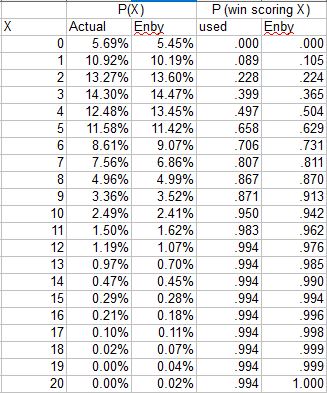
Given these constraints, I have always promised to use Enby to develop estimated rather than empirical probabilities of winning a game when scoring X runs, given some fixed average runs allowed per game (or the complement from the defensive perspective). Suppose that the major league average is 4.5 runs/game. Given this, we can use Enby to estimate the probability of scoring X runs in a game (since the goal here is to estimate W%, I am using Enby with a Tango Distribution c parameter = .852, which is used for head-to-head matchups):

From here, the logic to estimate the probability of winning is fairly straightforward. If you score zero runs, you always lose. If you score one run, you win if you allow zero runs. If you allow one run, then the game goes to extra innings (I’m assuming that Enby represents per nine inning run distributions, just as we did for the Cigol estimates. Since the major league average innings/game is pretty close to nine, this is a reasonable if slightly imprecise assumption), in which case we’ll assume you have a 50% chance to win (we’re not building any assumptions about team quality in as we do in Cigol, necessitating an estimate of winning in extra innings that reflects expected runs and expected runs allowed). So a team that scores 1 run should win 5.39% + 10.11%/2 = 10.44% of those games.
If you score two runs, you win all of the games where you allow zero or one, and half of the games where you allow 2, so 5.39% + 10.11% + 13.53%/2 = 22.26%. This can be very easily generalized:
P(win given scoring X runs) = sum (from n = 0 to n = x - 1) of P(n) + P(x)/2
Where P(y) = probability of allowing y runs
Thus we get this chart:

It should be evident that the probability of winning when allowing X runs is the complement of the probability of winning when scoring X runs, although this could also be calculated directly from the estimated run distribution.
Now, instead of using the empirical data for any given league/season to calculate gOW%, we can use Enby to generate the expected W%s, eliminating the sample size concerns and enabling us to customize the run environment under consideration. I did just that for the 2016 majors, where the average was 4.479 R/G (Enby distribution parameters are r = 4.082, B = 1.1052, z = .0545):

The first two columns compare the actual 2016 run distribution to Enby. The next set compares the empirical probability of winning when scoring X runs (I modified it to use a uniform value for games in which 12+ runs were scored, for the purpose of calculating gOW% and gDW%) to the Enby estimated probability. The Enby probabilities are generally consistent with the observed probabilities for 2016, but as expected there are some differences, and note that Enby is assuming independence of runs scored and runs allowed in a single game which environmental conditions alone make an assumption that can be most positively described as “simplifying”.
The resulting gOW% and gDW% from using the Enby estimated probabilities:
There is not a huge difference between these and the empirical figures. One thing that is lost by switching to theoretical values is that the league does not necessarily balance to .500. In 2016 the average gOW% was .497 and the average gDW% was .502.
However, the real value of this approach is that we no longer are forced to pretend that runs are equally valuable in every context. Note that Colorado had the second-highest OW% and third-lowest DW% in the majors. Anyone reading this blog knows that this is mostly a park illusion. If you look at park-adjusted R/G and RA/G, Colorado ranked seventeenth and nineteenth-best respectively, with 4.42 and 4.50 (again the league average R/G was 4.48), so the Rockies were slightly below average offensively and defensively. While we certainly don’t expect our estimate of their offensive or defensive quality using aggregate season runs to precisely match our estimate when considering their run distributions on a game basis (if they did, this whole exercise would be a complete waste of time), it would be quite something if a single team managed to be wildly efficient on offense and wildly inefficient on defense.
When we consider that Colorado’s park factor was 1.18, in order to compute gOW%/gDW% in the run environment in which they played, we need to take the league average of 4.479 R/G x 1.18 = 5.29. (We could of course use the NL average R/G here as well; I’m intending this post as an example of how to do the calculations, not a full implementation of the metrics. For the same reason, I will round that park adjusted average up a tick to 5.3 R/G, since I already have the Enby distribution parameters handy at increments of .05 R/G). With c = .852, we have an Enby distribution with r = 5.673, B = .9363, z = .0257. The resulting Enby estimates of scoring frequency and W% scoring/allowing X runs are:

Using these estimated W%s, the Rockies gOW% drops from .560 to .485 and their gDW% increases from .437 to .508. As suggested by their park-adjusted R/G figures, Colorado’s offense and defense were both about average; their defense fares a little better when looking at the game distribution than when using aggregate totals, and the opposite for the offense.
Some readers are doubtlessly thinking that by aggregating at the season level, we’ve lost some key detail. We could have looked at Colorado home and road games separately, each with a distinct set of Enby parameters and corresponding probabilities of winning when scoring X runs rather than lumping it altogether and applying the park factor that considers that half of the games are on the road. This of course is true; you can slice and dice however you’d like. I find the team seasonal level to be a reasonable compromise.
This is beyond the scope of this series, so I will mention it briefly and move on. I have previously combined gOW% and gDW% into a single W% estimate by converting each into an equivalent run ratio using Pythagenpat math, then using Pythagenpat to convert those ratios into a W% estimate. This makes theoretical sense, although it loses sight of using the actual runs scored and allowed distributions of a team in a season and rearranging them (“bootstrapping” if you must). It occurred to me in writing this post that I could just use the same logic I use to convert Enby probabilities of scoring X runs into an estimated W% for the team. For example, we could use the Rockies runs scored distribution to estimate how often they would win when allowing x runs and use this in conjunction with their runs allowed distribution to estimate a W% given their runs allowed distribution. Then we could do the same with their runs scored/runs allowed to estimate a W% given their runs scored distribution. Averaging these two estimates would, in essence, put together every possible combination of their actual runs distribution from the season and calculate the average expected wins. For a simple example that avoids “ties”, if a team played two games, winning one 3-1 and the other 7-5, we would make every possible combination (3-1, 3-5, 7-1, 7-5) and estimate a .750 gEW%, compared to a 1.000 W% and a .720 Pythagenpat W%.
Here’s an example for the 2016 Rockies:

The first two columns tell us that the Rockies scored two runs in 16 games and allowed two in 15 games. After converting these to frequencies, we can easily calculate the probability of winning giving that the team scores X runs in the same manner as we did above with Enby probabilities. For example, when the Rockies score two runs, they will win if they allowed zero (5.56%) or one (8.64%), and half of games in which they allow two (9.26%), for a win probability of 5.56% + 8.64% + 9.26%/2 = 18.8%. Figured this way, the Colorado’s gOW% is .494, their gDW% is .496, and thus their gEW% is .495. Please note that I’m not suggesting that using the team’s actual frequencies of scoring/allowing X runs is preferable to using league averages or Enby. Furthermore, the gOW% and gDW% components are not useful, since they make the estimate of the quality of the offense or defense dependent on its counterpart.
Wednesday, August 21, 2019
A Most Pyrrhic Victory
It’s never fun to be in a position where you feel like your team’s short-term success will hamper its long-term prospects. For one, it is inherently an arrogant thought - holding that you can perceive something that often the professionals that run the team cannot (although one of the most common occurrences of this phenomenon in sports, rooting against current wins with an eye to draft position, doesn’t fit). It feels like a betrayal of the loyalty you supposedly hold as a fan, specifically with the players that you like who are caught in the crossfire. Most significantly, it’s just not fun - sports are fun when your team wins, not win they lose, even if you rationalize those losses as just one piece of a grander design.
It is even harder when the team in question represents your alma mater, an institution to which you feel an immense loyalty and pride, one far deeper than anything you feel towards any kind of social or religious institution, professional organization, or (of course) a government. Such is the predicament that I find myself in when following the fortunes of Ohio State baseball. It is a position I have never been in before as a fan of OSU sports - I have rarely been part of the rabble calling for a regime change in any sport, and in the one case I can recall in which I was, it wasn’t with any kind of glee or malice. I believed that the coach in question wanted to win, was trying their best, was a worthy representative of the university, might even succeed in turning it around if given the opportunity - but that it was probably time to reluctantly pull the plug.
None of this holds when considering the position of Greg Beals. Beals’ tenure at OSU now stretches, incredibly, over nine seasons, nine seasons that are much worse than any nine season stretch that proceeded it in the last thirty years of OSU baseball. A stretch of nine seasons in which a Big Ten regular season title has rarely been more than a pipe dream. I don’t feel like recounted the depressing details in this space - the season preview posts for the next four seasons will provide ample opportunity. That’s right - Beals now holds a three-year extension that takes him through 2023.
How has he managed to pull this off? Apparently with another well-timed run in the Big Ten Tournament, winning the event for the second time and thus earning an automatic bid to the NCAA tournament. It’s not as if the Buckeyes were on the bubble before the tournament - well actually, they were. They were squarely on the bubble for the Big Ten tournament. OSU’s overall season record ended up at 36-27, but if you look deeper it was worse than that. At 12-12 in the Big Ten, they finished in a three-way tie for sixth place, needing help on the final day to qualify for the eight team field. Then they turned around and won it.
In the NCAA tournament, the Buckeyes were thumped by Vanderbilt, eked out a thirteen-inning victory over McNeese to stay alive, then falling to Indiana State. To add insult to injury, another Big Ten team, the one from the heart of darkness, also had an unlikely tournament run. Except that outfit, channeling the spirit of departed basketball coach/practitioner of the dark arts John Beilein, made their run in the NCAA tournament, all the way to 1-0 lead in the final series before the aforementioned Commodores restored order to the universe.
The Buckeyes were actually outscored by one run on the season, averaging 5.56 runs scored and 5.57 runs allowed per game. Compared to the average Big Ten team, the Bucks were +10 runs offensively and -15 runs defensively. However, this obscures some promising developments on the pitching side. The weekend rotation of Seth Lonsway (9 RAA, 12.3 K/5.8 W), Garrett Burhenn (10, 6.8/3.1), and Griffan Smith (3, 8.9/3.8) was surprisingly effective given its youth (sophomore, sophomore, freshman respectively). Relief ace Andrew Magno was absolutely brilliant (22, 10.4/5.0) with some heroic and perhaps ill-advised extended appearances in the tournaments; he was popped in the fifteenth round by Detroit. Outside of them, there were a group of relievers clustered between 2 and -3 RAA (Joe Gahm, Thomas Waning, Will Pfenig, and TJ Root) and a few rough lines - midweek starter Jake Vance had a 7.90 RA in 41 innings for -11 RAA, and three relievers (Mitch Milheim, TJ Brock, and usual position player Brady Cherry) combined for 57 innings and a whopping 65 runs allowed for -31 RAA. Thankfully most of these were low-leverage innings.
The pitching was also not done any favors by the defense, as Ohio recorded a DER of just .641 compared to a conference average of .656. The good news is that the offense made up for it at the plate; the bad news is that the best hitters have exhausted or foregone their remaining eligibility. The biggest excpetion was sophomore Dillon Dingler, who returned to his natural position behind the plate after a freshman year spent in center and hit .291/.391/.424 for 9 RAA. Junior Connor Pohl was just an average hitter playing first base, but is a solid defender and was durable. Senior Kobie Foppe lost the second base job as he struggled mightily over his 118 PA (.153/.284/.194); junior utility man Matt Carpenter assumed the role but only hit .257/.300/.324 himself. Sophomore Noah West started the season at shortstop and was much improved offensively (.284/.318/.420), but his injury led to a reshuffling of the defensive alignment, with freshman Zack Dezenzo moving over from third (he hit a solid .256/.316/.440 with 10 longballs) and classmate Marcus Ernst assuming the hot corner (.257/.316/.300 over 76 PA) before yielding to yet another freshman, Nick Erwin (.235/.288/.272 over 147 PA).
Senior Brady Cherry finally fulfilled his potential, mashing .314/.385/.563 for 23 RAA in left field. Little-used fifth-year senior Ridge Winand wound up as the regular center fielder, although his bat did not stand out (.243/.335/.347). In right field, junior Dominic Canzone had one the finest seasons ever by a Buckeye hitter, parlaying a .345/.432/.620 (37 RAA) line into an eighth-round nod from Arizona. Sophomore backup catcher Brent Todys eventually assume DH duties thanks to his power (.256/.345/.462); his .206 ISO trailed only Canzone and Cherry, who each blasted sixteen homers.
So the Beals era rolls on, and at least another Big Ten tournament title has been added to the trophy case. When official SID releases after the season-ending NCAA tournament loss to Indiana State say “Buckeyes Championship Season Comes to an End”, you wonder whether there is some sarcasm even amongst people who are paid to provide favorable coverage. And then you realize no, it’s not even spin, they really believe it. Once #BealsBall takes root, it is nigh near impossible to make it just go away.