For the last several years I have published a set of team ratings that I call "Crude Team Ratings". The name was chosen to reflect the nature of the ratings--they have a number of limitations, of which I documented several when I introduced the methodology.
I explain how CTR is figured in the linked post, but in short:
1) Start with a win ratio figure for each team. It could be actual win ratio, or an estimated win ratio.
2) Figure the average win ratio of the team’s opponents.
3) Adjust for strength of schedule, resulting in a new set of ratings.
4) Begin the process again. Repeat until the ratings stabilize.
The resulting rating, CTR, is an adjusted win/loss ratio rescaled so that the majors’ arithmetic average is 100. The ratings can be used to directly estimate W% against a given opponent (without home field advantage for either side); a team with a CTR of 120 should win 60% of games against a team with a CTR of 80 (120/(120 + 80)).
First, CTR based on actual wins and losses. In the table, “aW%” is the winning percentage equivalent implied by the CTR and “SOS” is the measure of strength of schedule--the average CTR of a team’s opponents. The rank columns provide each team’s rank in CTR and SOS:

The top ten teams were the playoff participants, with the two pennant winners coming from the group of three teams that formed a clear first-tier. The #9 and #10 teams lost the wildcard games. Were it not for the identity of the one of those three that did not win the pennant, it would have been about as close to perfect a playoff outcome as I could hope for. What stood out the most among the playoff teams to me is that Arizona ranked slightly ahead of Washington. As we’ll see in a moment, the NL East was bad, and as the best team in the worst division, the Nationals had the lowest SOS in the majors, with their average opponent roughly equivalent to the A’s, while the Diamondbacks’ average opponent was roughly equivalent to the Royals.
Next are the division averages. Originally I gave the arithmetic average CTR for each divison, but that’s mathematically wrong--you can’t average ratios like that. Then I switched to geometric averages, but really what I should have done all along is just give the arithemetic average aW% for each division/league. aW% converts CTR back to an “equivalent” W-L record, such that the average across the major leagues will be .50000. I do this by taking CTR/(100 + CTR) for each team, then applying a small fudge factor to force the average to .500. In order to maintain some basis for comparison to prior years, I’ve provided the geometric average CTR alongside the arithmetric average aW%, and the equivalent CTR by solving for CTR in the equation:
aW% = CTR/(100 + CTR)*F, where F is the fudge factor (it was 1.0005 for 2017 lest you be concerned there is a massive behind-the-scenes adjustment taking place).

The league gap closed after expanding in 2016, but the AL maintained superiority, with only the NL West having a higher CTR than any AL division. It was a good bounceback for the NL West after being the worst division in 2016, especially when you consider that the team that had been second-best for several years wound up as the second-worst team in the majors. The NL East was bad, but not as bad as it was just two years ago.
I also figure CTRs based on various alternate W% estimates. The first is based Expected W%, (Pythagenpat based on actual runs scored and allowed):

The second is CTR based on Predicted W% (Pythagenpat based on runs created and allowed, actually Base Runs):

Usually I include a version based on Game Expected Winning %, but this year I’m finally switching to using the Enby distribution so it’s going to take a little bit more work, and I’d like to get one of these two posts up before the end of the year. So I will include the CTRs based on gEW% in the Run Distribution post.
A few seasons ago I started including a CTR version based on actual wins and losses, but including the postseason. I am not crazy about this set of ratings, the reasoning behind which I tried very poorly to explain last year. A shorter attempt follows: Baseball playoff series have different lengths depending on how the series go. This has a tendency to exaggerate the differences between the teams exhibited by the series, and thus have undue influence on the ratings. When the Dodgers sweep the Diamondbacks in the NLDS, this is certainly additional evidence that we did not previously have which suggests that the Dodgers are a stronger team than the Diamondbacks. But counting this as 3 wins to 0 losses exaggerates the evidence. I don’t mean this in the (equally true) sense that W% over a small sample size will tend to be more extreme than a W% estimate based on components (R/RA, RC/RCA, etc.) This we could easily account for by using EW% or PW%. What I’m getting at is that the number of games added to the sample is dependent on the outcomes of the games that are played. If series were played through in a non-farcical manner (i.e. ARI/LA goes five games regardless of the outcomes), than this would be a moot point.
I doubt that argument swayed even one person, so the ratings including playoff performance are:

With the Dodgers holding a 161 to 156 lead over the Astros before the playoffs, romping through the NL playoffs at 7-1 while the Astros went 7-4 in the AL playoffs, and taking the World Series to seven games, they actually managed to increase their position as the #1 ranked team. I’m not sure I’ve seen that before--certainly it is common for the World Series winner to not be ranked #1, but usually they get closer to it than further away.
And the differences between ratings include playoffs (pCTR) and regular season only (rCTR):

Monday, December 18, 2017
Crude Team Ratings, 2017
Monday, December 11, 2017
Hitting by Position, 2017
Of all the annual repeat posts I write, this is the one which most interests me--I have always been fascinated by patterns of offensive production by fielding position, particularly trends over baseball history and cases in which teams have unusual distributions of offense by position. I also contend that offensive positional adjustments, when carefully crafted and appropriately applied, remain a viable and somewhat more objective competitor to the defensive positional adjustments often in use, although this post does not really address those broad philosophical questions.
The first obvious thing to look at is the positional totals for 2016, with the data coming from Baseball-Reference.com. "MLB” is the overall total for MLB, which is not the same as the sum of all the positions here, as pinch-hitters and runners are not included in those. “POS” is the MLB totals minus the pitcher totals, yielding the composite performance by non-pitchers. “PADJ” is the position adjustment, which is the position RG divided by the overall major league average (this is a departure from past posts; I’ll discuss this a little at the end). “LPADJ” is the long-term positional adjustment that I use, based on 2002-2011 data. The rows “79” and “3D” are the combined corner outfield and 1B/DH totals, respectively:

After their record-smashing performance in 2016, second basemen regressed to the mean, although they still outproduced the league average. The mid-defensive spectrum positions, third base and centerfield, were both similarly about 3% above their historical norms, but the real story of 2017 positional offense was DH. DHs were essentially as productive as shortstops. Looking at the two positions’ respective slash lines, DH had the better secondary average, SS the better batting average for the same run output. While DH has been down in recent years, they were at a much more respectable 109 last year. One year of this data tends to yield more blips than trends, although after a league average performance in 2016 left fielders only improved slightly to 102.
Moving on to looking at more granular levels of performance, I always start by looking at the NL pitching staffs and their RAA. I need to stress that the runs created method I’m using here does not take into account sacrifices, which usually is not a big deal but can be significant for pitchers. Note that all team figures from this point forward in the post are park-adjusted. The RAA figures for each position are baselined against the overall major league average RG for the position, except for left field and right field which are pooled.

While positions relative to the league bounce around each year, it seems that the most predictable thing about this post is that the difference between the best and worst NL pitching staffs will be about twenty runs at the plate. As a whole, pitchers were at 0.00 runs created/game, which is the first time I’ve estimated them at 0, although they dipped into the negative in 2014 then crept back into positive territory for two years.
I don’t run a full chart of the leading positions since you will very easily be able to go down the list and identify the individual primarily responsible for the team’s performance and you won’t be shocked by any of them, but the teams with the highest RAA at each spot were:
C--CHN, 1B--CIN, 2B--HOU, 3B--CHN, SS--HOU, LF--NYN, CF--LAA, RF--MIA, DH—SEA
More interesting are the worst performing positions; the player listed is the one who started the most games at that position for the team:

Usually this list is more funny than sad, but almost every player that led one of these teams in starts was at one time considered (by some, maybe, in the case of Alcides Escobar) to be an outstanding player. Mercifully Mark Trumbo led Oriole DHs to a worse composite performance than the Angels or it would have been a veritable tragedy. Although the depressing nature of this list is offset significantly by the presence of the Kansas City shortstops and their Esky Magic, it is also not fair to Eduardo Nunez, who hit fine as a SF 3B (764 OPS in 199 PA). The real culprits for the Giants were, well, everyone else who played third base, with a max 622 OPS out of Christian Arroyo, Pablo Sandoval, Kelby Tomlinson, Jae-gyun Hwan, Connor Gillaspie, Ryder Jones, Aaron Hill, and Orlando Calixte. Giant third basemen other than Nunez hit a combined un-park adjusted 174/220/246. Props to Austin Slater who had a single in his only PA as Giant third basemen, joining Nunez as the only non-horrible performer of the bunch.
I like to attempt to measure each team’s offensive profile by position relative to a typical profile. I’ve found it frustrating as a fan when my team’s offensive production has come disproportionately from “defensive” positions rather than offensive positions (“Why can’t we just find a corner outfielder who can hit?”) The best way I’ve yet been able to come up with to measure this is to look at the correlation between RG at each position and the long-term positional adjustment. A positive correlation indicates a “traditional” distribution of offense by position--more production from the positions on the right side of the defensive spectrum. (To calculate this, I use the long-term positional adjustments that pool 1B/DH as well as LF/RF, and because of the DH I split it out by league.) There is no value judgment here--runs are runs whether they are created by first basemen or shortstops:

The two teams with the most extreme correlations did so because of excellence (which we’ll see further evidence of in the next set of charts) from either a position group that is expected to provide offense (Miami’s outfielders) or from one that is not (Houston’s middle infielders). The signing of Edwin Encarnacion helped the Indians record a high correlation, as the rest of the positions didn’t strongly match expectations and the middle infielders hit very well.
The following tables, broken out by division, display RAA for each position, with teams sorted by the sum of positional RAA. Positions with negative RAA are in red, and positions that are +/-20 RAA are bolded:

In 2016, the Yankees were last in the division in RAA; this year they were the only above-average offense, led by the AL’s most productive outfield. The Red Sox nearly did the opposite, going from the best offense in the AL to a lot of red, highlighted by the AL’s worst corner infield production. They were the only AL team to have just one above average positon. To what extent the Blue Jays hit, it was from the right side of the defensive spectrum; their catchers and middle infielders were the worst in MLB.

The Indians had very balanced offensive contributions relative to position, with the +36 for DH inflated by the fact that here DH are compared to the (historically-low) 2017 positional average rather than a longer-term benchmark. Seeing the Detroit first basemen at -20 is sad. Kansas City had the worst outfield in the AL, as it seems it takes more than Esky Magic and “timely hitting” and “putting the ball in play” (yes, I realize their frequency of doing the latter has tailed off) to score runs.

Houston led all of MLB in infield and middle infield RAA, and they were the only AL team to have just one below average position. Los Angeles had the worst infield in MLB, and shortstop was the only position that chipped in to help Mike Trout.

Miami led MLB in outfield RAA; of course Giancarlo Stanton was the driving force but all three spots were outstanding. Washington had the NL’s top infield, Philadelphia the worst. But what jumped out at me in the NL East was how good Atlanta’s catchers were. Only the Cubs had a higher RAA. Atlanta’s unlikely duo was Tyler Flowers (282/382/447 in 368 PA overall) and Kurt Suzuki (284/355/539 in 306 PA). I have to admit I watch a lot of Braves games this year, so I am floored to see that Suzuki pulled a .255 ISO out of a hat; non-park adjusted, it was his career high by 94 points, and the .160 came a full decade ago.
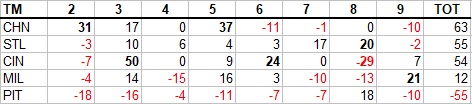
The Cubs had two positions that led the majors in RAA, a good showing from first base--and otherwise a lot of average and below average. Cincinnati led the majors in RAA from corner infielders; Joey Votto is obvious, but Eugenio Suarez led the third basemen to a fine showing as well. Pittsburgh was the only NL team to have just one position show up in black font, but there’s a reason I’m not constructing that to say anything about “below average”...

The Dodgers joined the Nationals as the only NL teams to have just one below-average position and led the NL in middle infield RAA. Arizona and San Diego tied for the worst middle infield RAA in the NL, while the Giants had the worst corner infielders and outfielders in the majors. The remarkably bad third basemen, the single worst position in the majors, were discussed in greater detail above. But the Padres might have the most dubious distinction on this list; they had not a single position that was above average. It doesn’t stand out here because I zero is displayed in black font rather than red, and to be fair they had two positions at zero, as well as single positions at -1, -2, and -4; it’s not as if every position was making outs with no redeeming value. And their pitchers were +9, so they can hang their hat on that.
The full spreadsheet with data is available here.