A couple of caveats apply to everything that follows in this post. The first is that there are no park adjustments anywhere. There's obviously a difference between scoring 5 runs at Petco and scoring 5 runs at Coors, but if you're using discrete data there's not much that can be done about it unless you want to use a different distribution for every possible context. Similarly, it's necessary to acknowledge that games do not always consist of nine innings; again, it's tough to do anything about this while maintaining your sanity.
All of the conversions of runs to wins are based only on 2013 data. Ideally, I would use an appropriate distribution for runs per game based on average R/G, but I've taken the lazy way out and used the empirical data for 2013 only. (I have a methodology I could use to do estimate win probabilities at each level of scoring that take context into account, but I’ve not been able to finish the full write-up it needs on this blog before I am comfortable using it without explanation).
The first breakout is record in blowouts versus non-blowouts. I define a blowout as a margin of five or more runs. This is not really a satisfactory definition of a blowout, as many five-run games are quite competitive--"blowout” is just a convenient label to use, and expresses the point succinctly. I use these two categories with wide ranges rather than more narrow groupings like one-run games because the frequency and results of one-run games are highly biased by the home field advantage. Drawing the focus back a little allows us to identify close games and not so close games with a margin built in to allow a greater chance of capturing the true nature of the game in question rather than a disguised situational effect.
In 2013, 74.7% of major league games were non-blowouts while the complement, 25.3%, were. Team record in non-blowouts:

And in blowouts:

Teams sorted by difference between blowout and non-blowout W%, as well as the percentage of blowouts for each team:

Baltimore is one of the teams that interest me here; their unbelievable one-run record in 2012 was well-documented, and so it shouldn’t surprise that the Orioles ranked second in the majors in 2012 in non-blowout W% but were just over .500 in non-blowouts (23-21). In 2013, Baltimore just quit playing in blowouts, with only 15% of their games decided by five or more runs (only the White Sox at 17% joined them under 20% blowouts), but when they did they had a 14-11 record. Boston had the largest W% differential between blowouts and non-blowouts and were also the best team in the majors per most result-based perspectives.
A more interesting way to consider game-level results is to look at how teams perform when scoring or allowing a given number of runs. For the majors as a whole, here are the counts of games in which teams scored X runs:

The “marg” column shows the marginal W% for each additional run scored. In 2013, the second run was the marginally most valuable while the fourth was the cutoff point between winning and losing.
I use these figures to calculate a measure I call game Offensive W% (or Defensive W% as the case may be), which was suggested by Bill James in an old Abstract. It is a crude way to use each team’s actual runs per game distribution to estimate what their W% should have been by using the overall empirical W% by runs scored for the majors in the particular season.
A theoretical distribution would be much preferable to the empirical distribution for this exercise, but as I mentioned earlier I haven’t yet gotten around to writing up the requisite methodological explanation, so I’ve defaulted to the 2013 empirical data. Some of the drawbacks of this approach are:
1. The empirical distribution is subject to sample size fluctuations. In 2013, teams that scored 7 runs won 85.8% of the time while teams that scored 8 runs won 83.2% of the time. Does that mean that scoring 7 runs is preferable to scoring 8 runs? Of course not--it's a quirk in the data. Additionally, the marginal values don’t necessary make sense even when W% increases from one runs scored level to another (In figuring the gEW% family of measures below, I lumped all games with 7 and 8 runs scored/allowed into one bucket, which smoothes any illogical jumps in the win function, but leaves the inconsistent marginal values unaddressed and fails to make any differentiation between scoring 7 and 8. The values actually used are displayed in the “use” column, and the “invuse” column is the complements of these figures--i.e. those used to credit wins to the defense. I've used 1.0 for 12+ runs, which is a horrible idea theoretically. In 2013, teams were 102-0 when scoring 12 or more runs).
2. Using the empirical distribution forces one to use integer values for runs scored per game. Obviously the number of runs a team scores in a game is restricted to integer values, but not allowing theoretical fractional runs makes it very difficult to apply any sort of park adjustment to the team frequency of runs scored.
3. Related to #2 (really its root cause, although the park issue is important enough from the standpoint of using the results to evaluate teams that I wanted to single it out), when using the empirical data there is always a tradeoff that must be made between increasing the sample size and losing context. One could use multiple years of data to generate a smoother curve of marginal win probabilities, but in doing so one would lose centering at the season’s actual run scoring rate. On the other hand, one could split the data into AL and NL and more closely match context, but you would lose sample size and introduce more quirks into the data.
I will use my theoretical distribution (Enby, which you can read about here) for a few charts in this post. The first is a comparison of the frequency of scoring X runs in the majors to what would be expected given the overall major league average of 4.166 R/G (Enby distribution parameters are r = 3.922, B = 1.07, z = .0649):

Enby generally does a decent job of estimating the actual scoring distribution, and while I am certainly not an unbiased observer, I think it does so here as well.
I will not go into the full details of how gOW%, gDW%, and gEW% (which combines both into one measure of team quality) are calculated in this post, but full details were provided here. The “use” column here is the coefficient applied to each game to calculate gOW% while the “invuse” is the coefficient used for gDW%. For comparison, I have looked at OW%, DW%, and EW% (Pythagenpat record) for each team; none of these have been adjusted for park to maintain consistency with the g-family of measures which are not park-adjusted.
For most teams, gOW% and OW% are very similar. Teams whose gOW% is higher than OW% distributed their runs more efficiently (at least to the extent that the methodology captures reality); the reverse is true for teams with gOW% lower than OW%. The teams that had differences of +/- 2 wins between the two metrics were (all of these are the g-type less the regular estimate):
Positive: CHA, MIL, CHN, BAL, MIA, PIT, MIN
Negative: BOS, OAK, STL, TEX, CLE
There were an abnormally high number of teams this season whose gOW% diverged significantly from their standard OW%; as you’ll see in a moment, the opposite was true for gDW%. The White Sox gOW% of .467 was 3.5 games better than their OW% of .445. Their gOW% was seventh-lowest in the majors, but their OW% was second-worst. So while their offense was still bad, they wound up distributing their runs in a manner that should have resulted in more wins than one would expect from their R/G average.
As such, Chicago makes for an interesting case study in how a measly 3.69 runs/game can be doled out more efficiently. The black line is Chicago’s actual 2013 run distribution, the blue line is Enby’s estimate for a team averaging 3.691 R/G (r = 3.662, B = 1.018, z = .0853), and the red line is that of the majors as a whole (Chicago did not actually score more than twelve runs in a game this season, but fifteen is the standard I’ve always used in these graphs):

Chicago scored 3, 4, and 5 runs significantly more often than Enby would expect and more often that the major league average despite having a poor offense. 3-5 runs is a good spot to be in, at least in the current scoring environment--in 2013, teams won 54% of the time when scoring 3-5.
I deliberately wrote the preceding paragraph to be a little misleading--Chicago's propensity to score 3-5 runs was not really a positive, since it meant fewer games in which they scored more than five runs. The White Sox were shutout more often than the major league average (8% to 6.8%), scored < 2 runs more often than average (19.1% to 18%), but scored < 3 runs less often than average (50.6% to 47.8%). That is the only step at which Chicago was above average, and they quickly fell into well below average territory--Chicago scored < 6 runs 82% of the time versus the average of 71.9%:

Teams with differences of +/- 2 wins between gDW% and standard DW%:
Positive: SEA
Negative: ATL, TEX, OAK
The 3.7 win discrepancy between Atlanta’s gDW% (.570) and standard DW% (.592) was the largest such difference for any unit in the majors (greater than Chicago’s gOW% difference). The Braves were the only team which did not allow eleven or more runs in a game; the average was 3.4% and only Oakland (one) and St. Louis (two) had fewer than three such games. Avoiding those disaster games helped keep their RA/G low, but the Braves allowed four and five runs more often than both the Enby expectation for a team allowing 3.383 runs per game (r = 3.478, B = .983, z = .1023) would predict and the major league average:

Teams with differences of +/- 2 wins between gEW% and EW% (standard Pythagenpat):
Positive: SEA, CHA, PHI, PIT, MIN, CHN
Negative: OAK, TEX, STL, ATL, BOS, CLE, CIN
The negative list includes all playoff teams which obviously were not too badly hampered by seemingly inefficient run distributions. Standard Pythagenpat had a freakishly good year predicting actual W% in 2013, with a RMSE of 3.66 while gEW% had a 3.95 RMSE. gEW% does not incorporate any knowledge about the joint distribution of runs scored and allowed; if you do that, you may as well just look at actual win-loss record. But since it doesn’t have knowledge of the joint distribution, it’s quite possible for standard EW% to perform better as a predictor.
For now most of the applications of this methodology, at least in my writings, have been freak show in nature. The more interesting questions will be easier to investigate once I’ve finished my update of the Enby methodology. Do certain types of offenses tend to bunch their runs more efficiently? Can the estimate of variance of runs scored (which is really the key assumption underpinning Enby) be improved by considering team characteristics? How well do efficient or non-efficient distributions by teams predict team performance in future years? I don’t mean to imply that others have not investigated these questions, simply that I hope to have more interesting material in these year-end reviews starting in 2014. I said that last year too though.

Tuesday, January 28, 2014
Run Distribution and W%, 2013

Tuesday, January 14, 2014
Crude Team Ratings, 2013
For the last few years I have published a set of team ratings that I call "Crude Team Ratings". The name was chosen to reflect the nature of the ratings--they have a number of limitations, of which I documented several when I introduced the methodology.
I explain how CTR is figured in the linked post, but in short:
1) Start with a win ratio figure for each team. It could be actual win ratio, or an estimated win ratio.
2) Figure the average win ratio of the team’s opponents.
3) Adjust for strength of schedule, resulting in a new set of ratings.
4) Begin the process again. Repeat until the ratings stabilize.
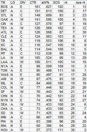
First, CTR based on actual wins and losses. In the table, “aW%” is the winning percentage equivalent implied by the CTR and “SOS” is the measure of strength of schedule--the average CTR of a team’s opponents. The rank columns provide each team’s rank in CTR and SOS:

This was a banner year for those of us who prefer the best teams to make it through the playoffs, as the pennant winners ranked one-two in MLB. The ten playoff teams were also the ten that had the most impressive win-loss records, with the exception of #9 Texas, but of course they had a shot in the one game playoff. Also, the Rangers were still only fifth in the AL so it’s not as if their schedule unfairly kept them out. What is a departure from recent seasons is that no other also-ran AL teams finished with higher ratings than the NL playoff qualifiers. Still, the AL dominated the top spots again as can be seen by the fact that only St. Louis snuck into the top five.
Below are the mean ratings for each league and division, actually calculated as the geometric rather than arithmetic mean:

Last year, the AL-NL gap was 112-89, and if you count Houston with the NL it was 106-88 in 2013. In any event, the AL remains the stronger league based on the interleague results (which is what underpins any differences in these rankings), with an implied W% of .521 against the NL.
Speaking of Houston, they actually ticked up a bit in CTR, from 46 to 48. While I wouldn’t claim that is a meaningful difference, it does indicate that their four win drop is largely a function of opponent quality, moving from the 21st most difficult schedule in 2012 to 4th in 2013. They also provide a good opportunity to point out that the schedule rankings are dependent on the quality of the team in question--Houston's schedule was tougher than that of their divisional opponents because they did not get the benefit of playing nineteen games against Houston.
Schedule can make a big difference when comparing two teams across leagues, in a tough and weak division--naturally, the largest schedule disparity is between the winner of the weakest division (NL East) and cellar dweller of the strongest (AL East). In the actual tallies, Atlanta was 96-66 and Toronto was 74-88. However, the ratings (as indicated by aW%) suggest that Atlanta was equivalent to a 92-70 team and Toronto to 78-84, an eight game swing in a head-to-head comparison. Atlanta’s SOS of 90 and Toronto’s of 112 implies that Toronto’s average opponent would have a .554 W% against Atlanta’s average opponent--comparable in 2013 CTR terms to the Dodgers or Rangers.
I will present the rest of the ratings with minimal comment. The next set is based on Pythagenpat record from R/RA:
Next is based on gEW%, which is explained in this post--some of the other exhibits for the annual post on that metric are a little more involved so I’m running these ratings first. The basic idea of gEW% is to take into account (separately) the distribution of runs scored and runs allowed per game for each team rather than simply using season totals as in Pythagenpat:

And finally, based on Runs Created and Allowed run through Pythagenpat:

These ratings are based on regular season data only, but one could also choose to include playoff results in the mix. Regardless of what your thoughts may be on the value of considering playoff data, it is most commonly omitted simply because of the way statistics are presented. It usually takes extra effort to combine regular season and playoff data.
So I decided to run the win-loss based ratings with playoff records and schedules included, and to see how large a difference it would create in the results. I was a little surprised by the results:

It’s not a surprise of course that Boston strengthened its rating--the Red Sox went 11-5 against very good competition. What did surprise me was that the only other playoff team to have a noticeable change in rating was Atlanta. Their 1-3 record against the Dodgers pushed their rating down by four points. Much of the movement in ratings for the other teams was felt by non-playoff teams whose SOS numbers fluctuated, in particular the AL East in which each team gained a point, and the NL in general, whose collective rating was pushed further down.
An angle that could make the playoff-inclusive ratings more interesting would be if I included regression in the ratings, which I do not. My reasoning is that I intend the ratings to be a reflection of the actual results of the season rather than an attempt to measure true quality of the teams. Additionally, regression would have little impact on the rank order of teams--it would mostly serve to compress the variance of the ratings. On the other hand, even if one wants to use the actual record of a team untouched to establish its rating, the case can be made that its opponents’ records should still be regressed, to avoid overcompensating for strength of schedule in ratings. Some purveyors of team ratings in other sports take a similar approach in basing calculations of opponent strength on those teams’ point-based rankings, but still base each team’s own rating on their actual wins and losses.
Again, though, these ratings are advertised as crude and are clearly only intended to be used in viewing 2013 retrospectively, so I’ve not bothered with regression here. I do use regression on the rare occasions when I use the CTRs to give crude estimates of win probabilities (such as playoff odds).
Monday, December 30, 2013
Crude NFL Ratings, 2013
Since I have a crude rating system set up to evaluate MLB teams that relies on win ratio and identity of opponents and thus can be adapted to any number of sports, I see no reason not to apply it to the lesser NFL once a year. Since I am only a casual follower of the NFL, I will endeavor to avoid excessive comment on the results.
As a brief overview, the ratings are based on win ratio for the season, adjusted over the course of several iterations for opponent’s win ratio. They know nothing about injuries, about where games were played, about the distribution of points from game to game; nothing beyond the win ratio of all of the teams in the league and each team’s opponents. The final result is presented in a format that can be directly plugged into Log5. I call them “Crude Team Ratings” to avoid overselling them, but they tend to match the results from systems that are not undersold fairly decently.
First are ratings based on actual wins and losses. 12.2 games of regression are included when figuring the win ratios (this will apply to the point-based ratings as well). CTR is the bottom line rating, aW% converts it to an adjusted W%, and SOS is the average CTR of the team’s opponents:

I prefer to focus on the ratings based on points and points allowed, which are coupled with a Pythagorean approach published at Pro-Football Reference to generate the win ratios:

As you can see, the top five teams all hail from the NFC South and West, which unfortunately had a maximum of four playoff spots available, leaving Arizona as the odd team out. Note that despite going 10-6, a raw record that was bettered by nine NFL teams, the Cardinals ranked sixth in win-based rating, so this is not a Pythagorean fluke. Arizona was a legitimately outstanding team based on the actual on-field results in 2013, but will sit home as far lesser teams battle it out thanks to the vagaries of their micro-division.
The Browns are second-to-last either way you figure it; by W-L record the Redskins are worse, but rank 30th by points, and by points the Jaguars are worse, but rank 27th by W-L.
I use the geometric mean of the CTR of each team to calculate division and conference ratings:

The NFC West would rank fourth if it was a team--it was an absurdly strong division, with all of its teams among the top ten. The ratings imply that the composite NFC team would be expected to win about 55.2% of the time against its AFC counterpart.
The ratings can be used to feed playoff odds, naturally; here home field is assumed to be a 32.6% boost to CTR (equivalent to a .570 home W%). I’m not going to bother with the round-by-round breakout of potential matchups as I do for MLB, but here are the overall crude odds:

It’s worth acknowledging that each of the last two Super Bowl champs were longshots by this or any other estimate--last year’s Ravens were given only a 3% chance. Of course, I’d also point out that the probability of any longshot winning (let’s define that as 5% rounded probability or lower) is 20% and was 14% in 2012.
These odds imply a 60% chance that the NFC champ will win the Super Bowl, but also a 95% chance that the NFC champ will be favored by the odds to win the Super Bowl. The AFC’s best team, Denver, would be favored in only two potential Super Bowl matchups, as would...all five other AFC teams. The top four playoff teams in CTR hail from the NFC, the next six from the AFC, and then the winners of the micro-division lottery, Philadelphia and Green Bay. The NFL frequently provides examples of why I dislike tiny divisions, but never as clearly or as destructively as in 2013.
Tuesday, December 17, 2013
Hitting by Position, 2013
Of all the annual repeat posts I write, this is the one which most interests me--I have always been fascinated by patterns of offensive production by fielding position, particularly trends over baseball history and cases in which teams have unusual distributions of offense by position. I also contend that offensive positional adjustments, when carefully crafted and appropriately applied, remain a viable and somewhat more objective competitor to the defensive positional adjustments often in use, although this post does not really address those broad philosophical questions.
The first obvious thing to look at is the positional totals for 2013, with the data coming from Baseball-Reference.com. "MLB” is the overall total for MLB, which is not the same as the sum of all the positions here, as pinch-hitters and runners are not included in those. “POS” is the MLB totals minus the pitcher totals, yielding the composite performance by non-pitchers. “PADJ” is the position adjustment, which is the position RG divided by the overall major league average (this is a departure from past posts; I’ll discuss this a little at the end). “LPADJ” is the long-term positional adjustment that I use, based on 2002-2011 data. The rows “79” and “3D” are the combined corner outfield and 1B/DH totals, respectively:

In 2012, there was an unusual convergence of overall positional RG for third base, DH, and all three outfield spots. This did not carry over to 2013 as a more typical spread returned to the defensive spectrum. Still, when compared to the long-term averages, there were quirks as usual. Catchers continued their strong performance with a PADJ of 94 after a 97 in 2012. Right fielders went back to their recent trend of solidly outhitting their left field cousins (one of the quirks that one must be cognizant of when attempting to use offensive data to craft positional adjustments). DHs were about as low as they’ve ever been (a 102 in 1985 is the only lower showing), and pitchers rebounded from a historical low of 1 to post a PADJ of 3, which obviously vindicates any continuing resistance to the DH.
That provides a useful segue from which to take a quick look at the performance by team of NL pitchers. I need to stress that the runs created method I’m using here does not take into account sacrifices, which usually is not a big deal but can be significant for pitchers. Note that all team figures from this point forward in the post are park-adjusted. The RAA figures for each position are baselined against the overall major league average RG for the position, except for left field and right field which are pooled. So pitchers as you can see from the chart above are compared to their robust average output of .11 runs per 25.5 outs:

Dodger pitchers led in BA, OBA, and SLG and ran away with the RG lead. Zack Greinke was the standout, hitting a raw .328/.409/.379 over 72 PA thanks to a .396 BABIP. Greinke drew seven walks, as many or more than the pitching collectives of the Padres, Marlins, Cubs, Reds, and Brewers. However, the most remarkable performance is that of Pittsburgh’s pitchers, who trudged through 318 plate appearances without a single extra base hit. In 2012 the Pirates only mustered one double in 304 PA. I assumed last year that the Pirate performance was without precedent, and clearly a .000 ISO has never been topped. San Francisco gave Pittsburgh a run for their money at the bottom of the list with a .099 BA and just one double and one triple.
I don’t run a full chart of the leading positions since you will very easily be able to go down the list and identify the individual primarily responsible for the team’s performance and you won’t be shocked by any of them, but the teams with the highest RAA at each spot were:
C--MIN, 1B--CIN, 2B--NYA, 3B--DET, SS--LA, LF--STL, CF--LAA, RF--WAS, DH--BOS
More interesting are the worst performing positions; the player listed is the one who appeared in the most games at that position for the team:

The Marlins, Blue Jays, and Yankees all land multiple names on the list, but Houston’s centerfielders were the very worst outfit, a hole that has been plugged elegantly by trading for Dexter Fowler. Jeff Mathis was also replaced in Miami by Jarrod Saltalamacchia, and Carlos Beltran should improve the Yankees production at right field and/or DH. Yankee DHs .186 BA was the worst of any non-NL pitcher spot, with Chicago, Toronto, and Miami catchers all posting a .193 mark. Or, to express their futility in another manner, it seems kind of shocking that only twelve team positions were less productive in terms of RG than Yankee DHs.
Teams with unusual profiles of offense by position has been of interest to me in recent years because of the way the Indians have been constructed--often they have gotten good production from positions on the right side of the defensive spectrum while struggling at the more offensively-inclined positions. The easiest way I’ve come up with to express this numerically is the correlation between a team’s RG by position and the long-term positional adjustment (I’ve pooled left and right field but not 1B and DH in this case; pitchers are excluded for all teams and DHs excluded for NL teams, and I’ve broken the lists out by league because of this):

As usual, the Indians had a negative correlation between PADJ and RG, but they were only the seventh-most extreme team in the majors. Seattle is the team which had the highest correlation, as they got little production from catcher and middle infield (2.6 RG from backstops, 3.2 from the keystone positions) while the four corners and DH all created at least 4.5 RG. On the flip side was Minnesota, largely due to the fact that catcher was easily their most productive position with 6.4 RG and their left fielders and DH created 3.3 RG, only better than their shortstops.
Boston and St. Louis won their pennants largely thanks to respectively having the best offense in their leagues, and in a neat coincidence here, they were near the middle of the pack in correlation for their leagues with identical marks of +.44.
The following charts, broken out by division, display RAA for each position, with teams sorted by the sum of positional RAA. Positions with negative RAA are in red, and positions that are +/-20 RAA are bolded:

Atlanta led the NL in corner infield RAA. New York was last in the NL in outfield RAA. Miami had the worst offense in the majors with a remarkable six positions at -20 runs or worse, and the left fielders just missed at -18. Only the Giancarlo Stanton-led right fielders were above average, and their +18 only managed to offset the opposite outfield corner. The whole division struggled with production from centerfield; the division total of -104 RAA from one position was easily the worst in the majors as the next worst division total was -49 from NL Central shortstops.

St. Louis led all of the majors in outfield RAA as they were the only team with two +20 positions in the outfield. Pittsburgh’s McCutchen-led centerfielders had the highest RAA of any position in the NL. Cincinnati’s offense continues to look wobbly post-Choo as only the star led first base, center, and right units were above average. As seen above, Milwaukee had the most unusual distribution of offense by position in the NL, and it’s actually somewhat impressive that they managed to field an average offense despite -37 runs from first base. Chicago had the worst middle infield RAA in the majors and their infield as a whole was awful at -70, with only the disaster in Miami sparing them from finishing last.

Los Angeles middle infielders led the NL in RAA; San Francisco and Arizona tied for the NL lead for total infield RAA. Colorado had the worst corner infield RAA in the NL, which may explain the desire (albeit not the decision) to give Justin Morneau a multi-year deal. This division had the highest total RAA for a position with 59 RAA from their shortstops.

Boston led the majors in total RAA as only their third basemen were below average. Red Sox middle infielders led the majors in RAA. The Yankees finishing with just two above average positions is still jarring; another way to look at their troubles is that they spent $50.5 million on their intended corner infield starters and wound up with the worst corner infield RAA in the majors.

Detroit led the majors in corner infield and overall infield RAA thanks almost solely their third basemen compiling a whopping 71 RAA (all Cabrera has other Tiger third basemen combined for 85 PA with a .222/.341/.306 line). The rest of their offense was far from impressive, though, although it wouldn’t be fair for me to snark too much about it since the 1,000 run talk was non-existent in the spring. The Indians were close to average around the diamond except for catcher and second base (excellent) and third base (bad). Kansas City’s middle infielders were last in the AL in RAA and as the corner infielders were bad as well, the infield’s total RAA was also last in the league. Minnesota had only one above average position and the worst outfield production in the majors. Chicago had just two above average positions, but just barely with a total of 3 RAA between, leading to the lowest team total RAA in the AL.

Angel outfielders led the AL in RAA, which of course is due to the great Mike Trout. Seattle’s offense is still bad, but the last two seasons have moved them past the laughingstock phase and into consistent organization deficiency status. Houston had only one above average position, but at least they have the excuse that they weren’t really trying; what can the Yankees say?
The full spreadsheet is available here.
Tuesday, December 10, 2013
Hitting by Lineup Position, 2013
I devoted a whole post to leadoff hitters, whether justified or not, so it's only fair to have a post about hitting by batting order position in general. I certainly consider this piece to be more trivia than sabermetrics, since there’s no analytical content.
The data in this post was taken from Baseball-Reference. The figures are park-adjusted. RC is ERP, including SB and CS, as used in my end of season stat posts. The weights used are constant across lineup positions; there was no attempt to apply specific weights to each position, although they are out there and would certainly make this a little bit more interesting.

NL #3 hitters have now topped all positions in RG for five years running, and again the AL demonstrated balance between #3 and #4 while NL teams got superior performance out of #3 hitters. The other curiosity that stands out to me is that #3 and #4 were the only lineup slots in which the NL had a higher RG. Throw in the fact that the other most celebrated “key” lineup spot (leadoff) was essentially even between the two leagues, and there’s enough fuel to construct some sort of theory (for which there wouldn’t be enough evidence to proceed logically, as if that’s ever stopped anyone before).
During the playoffs I remarked that it seemed like 2013 had been a year in which the notion of batting one’s best hitter #2 had gained traction; when presented with the actual numbers here, I’d be hard pressed to defend that statement. In addition to the overall RG, if this was the case I’d expect to see an uptick in isolated power for #2 hitters. However, AL #2 hitters collective .137 ISO was better only than that of AL #1, #8, and #9 hitters, and the same was true of the NL’s .130.
Next, here are the team leaders in RG at each lineup position. The player listed is the one who appeared in the most games in that spot (which can be misleading, particularly for the bottom the batting order where there is no fixed regular as in the case of the Dodgers #8 spot, or guys who move around the batting order like Jason Castro who takes the blame for Houston’s #3s):

And the worst:

The domination of bad AL lineup spots by just four teams is something I’ve not seen since I’ve been running this report. It’s not that unusual to have one team with several dead spots (Seattle’s hapless offenses pulled this off), but the White Sox, Astros, and Yankees all had multiple such holes. Chicago boasting four such disasters is an impressive feat. Meanwhile, while Ryan Howard hit better than the Phillies collective cleanup hitters, it’s still amusing to see they were the worst unit in the NL.
The next list is the ten best positions in terms of runs above average relative to average for their particular league spot (so leadoff spots are compared to the league average leadoff performance, etc.):

Baltimore’s #5s were significantly more productive than their #3s or #4s (4.4 and 5.4 RG respectively) thanks to Buck Showalter keeping Chris Davis in that spot for much of the season. The only other #5 spot to outhit both the #3s and #4s was Philadelphia (4.5, 4.1, 5.5 RG respectively) on the backs of the Dominic Brown-led performance which paced NL #5s.
The worst positions:

Chicago’s #9 hitters had a lower RG than three groups of NL #9s (LA, COL, and PHI). They were last among AL lineup slots in BA and OBA and just narrowly missed completing the rate stat sweep as NYA #9s slugged .265 (the only other AL lineup slot with a sub-.300 SLG was SEA #9 at .275). While some passage of time in baseball is sad, like Travis Hafner and Adam Dunn-fronted spots landing on this list, it’s comforting to still have Juan Pierre to kick around.
The last set of charts show each team’s RG rank within their league at each lineup spot. The top three are bolded and the bottom three displayed in red to provide quick visual identification of excellent and poor production:


It so happens that each pennant winner sticks out as having fielded a well-balanced, productive lineup--they ranked #1 and #2 in the majors in R/G, so it’s not a surprise, but other than the very bottom of the St. Louis lineup, there were no weak links in either team’s batting order.
The spreadsheet used to generate these figures is here.
Monday, December 02, 2013
Leadoff Hitters, 2013
This post kicks off a series of posts that I write every year, and therefore struggle to infuse with any sort of new perspective. However, they're a tradition on this blog and hold some general interest, so away we go.
This post looks at the offensive performance of teams' leadoff batters. I will try to make this as clear as possible: the statistics are based on the players that hit in the #1 slot in the batting order, whether they were actually leading off an inning or not. It includes the performance of all players who batted in that spot, including substitutes like pinch-hitters.
Listed in parentheses after a team are all players that started in twenty or more games in the leadoff slot--while you may see a listing like "OAK (Crisp)” this does not mean that the statistic is only based solely on Crisp's performance; it is the total of all Atlanta batters in the #1 spot, of which Crisp was the only one to start in that spot in twenty or more games. I will list the top and bottom three teams in each category (plus the top/bottom team from each league if they don't make the ML top/bottom three); complete data is available in a spreadsheet linked at the end of the article. There are also no park factors applied anywhere in this article.
That's as clear as I can make it, and I hope it will suffice. I always feel obligated to point out that as a sabermetrician, I think that the importance of the batting order is often overstated, and that the best leadoff hitters would generally be the best cleanup hitters, the best #9 hitters, etc. However, since the leadoff spot gets a lot of attention, and teams pay particular attention to the spot, it is instructive to look at how each team fared there.
The conventional wisdom is that the primary job of the leadoff hitter is to get on base, and most simply, score runs. It should go without saying on this blog that runs scored are heavily dependent on the performance of one’s teammates, but when writing on the internet it’s usually best to assume nothing. So let's start by looking at runs scored per 25.5 outs (AB - H + CS):
1. STL (Carpenter/Jay), 7.2
2. CIN (Choo), 6.3
3. BOS (Ellsbury), 5.9
Leadoff average, 4.8
ML average, 4.1
28. PHI (Rollins/Revere/Young/Hernandez), 3.7
29. HOU (Grossman/Villar/Altuve/Barnes), 3.4
30. MIA (Pierre/Yelich/Hechavarria), 3.0
Speaking of getting on base, the other obvious measure to look at is On Base Average. The figures here exclude HB and SF to be directly comparable to earlier versions of this article, but those categories are available in the spreadsheet if you'd like to include them:
1. CIN (Choo), .397
2. STL (Carpenter/Jay), .371
3. MIL (Aoki), .347
4. OAK (Crisp), .346
Leadoff average, .324
ML average, .314
28. NYN (Young), .289
29. MIN (Dozier/Presley/Carroll), .283
30. MIA (Pierre/Yelich/Hechavarria), .278
The next statistic is what I call Runners On Base Average. The genesis for ROBA is the A factor of Base Runs. It measures the number of times a batter reaches base per PA--excluding homers, since a batter that hits a home run never actually runs the bases. It also subtracts caught stealing here because the BsR version I often use does as well, but BsR versions based on initial baserunners rather than final baserunners do not.
My 2009 leadoff post was linked to a Cardinals message board, and this metric was the cause of a lot of confusion (this was mostly because the poster in question was thick-headed as could be, but it's still worth addressing). ROBA, like several other methods that follow, is not really a quality metric, it is a descriptive metric. A high ROBA is a good thing, but it's not necessarily better than a slightly lower ROBA plus a higher home run rate (which would produce a higher OBA and more runs). Listing ROBA is not in any way, shape or form a statement that hitting home runs is bad for a leadoff hitter. It is simply a recognition of the fact that a batter that hits a home run is not a baserunner. Base Runs is an excellent model of offense and ROBA is one of its components, and thus it holds some interest in describing how a team scored its runs, rather than how many it scored:
1. STL (Carpenter/Jay), .352
2. CIN (Choo), .348
3. BOS (Ellsbury), .322
Leadoff average, .294
ML average, .283
28. SEA (Miller/Chavez/Saunders), .260
29. MIA (Pierre/Yelich/Hechavarria), .254
30. MIN (Dozier/Presley/Carroll), .252
The Cardinals move ahead of the Reds here, making up the 26 point gap in standard OBA. Part of this is the obvious – home runs, as Cincinnati leadoff hitters hit 21 to St. Louis’ 11. But another factor is caught stealing, as we’ll see a little later--Reds leadoff hitters were just fifteen for thirty on stolen base attempts, tied for the second most caught stealing. St. Louis leadoff hitters were just three for six on steal attempts--no other team had fewer than ten stolen bases and only Kansas City had as few caught stealing (albeit with 15 SB), so the Cardinals easily had the fewest attempts (Detroit was next with fourteen).
I will also include what I've called Literal OBA here--this is just ROBA with HR subtracted from the denominator so that a homer does not lower LOBA, it simply has no effect. You don't really need ROBA and LOBA (or either, for that matter), but this might save some poor message board out there twenty posts, by not implying that I think home runs are bad, so here goes. LOBA = (H + W - HR - CS)/(AB + W - HR):
1. CIN (Choo), .358
2. STL (Carpenter/Jay), .358
3. BOS (Ellsbury), .327
Leadoff average, .300
ML average, .290
28. SEA (Miller/Chavez/Saunders), .268
29. MIN (Dozier/Presley/Carroll), .257
30. MIA (Pierre/Yelich/Hechavarria), .257
There is a high degree of repetition for the various OBA lists, which shouldn’t come as a surprise since they are just minor variations on each other.
The next two categories are most definitely categories of shape, not value. The first is the ratio of runs scored to RBI. Leadoff hitters as a group score many more runs than they drive in, partly due to their skills and partly due to lineup dynamics. Those with low ratios don’t fit the traditional leadoff profile as closely as those with high ratios (at least in the way their seasons played out):
1. MIA (Pierre/Yelich/Hechavarria), 2.2
2. MIL (Aoki), 2.1
3. PIT (Marte/Tabata), 2.1
7. TB (Jennings/Joyce/DeJesus), 1.9
Leadoff average, 1.6
27. CHN (DeJesus/Castro/Valbeuna), 1.3
28. MIN (Dozier/Presley/Carroll), 1.2
29. KC (Gordon), 1.2
30. TEX (Kinsler/Andrus/Martin), 1.1
ML average, 1.1
Again, this is not a quality list, as indicated by the mix of good and bad OBAs among the leaders and trailers. This is also a good interlude at which to remind you that the players listed are those who started twenty or more games in the leadoff spot for their teams and they are not solely responsible for the overall performance of the team’s leadoff hitters. David DeJesus lead off 66 games for the Cubs and 20 for the Rays and thus finds himself as part of both the leaders and trailers list here.
A similar gauge, but one that doesn't rely on the teammate-dependent R and RBI totals, is Bill James' Run Element Ratio. RER was described by James as the ratio between those things that were especially helpful at the beginning of an inning (walks and stolen bases) to those that were especially helpful at the end of an inning (extra bases). It is a ratio of "setup" events to "cleanup" events. Singles aren't included because they often function in both roles.
Of course, there are RBI walks and doubles are a great way to start an inning, but RER classifies events based on when they have the highest relative value, at least from a simple analysis:
1. NYN (Young), 1.7
2. HOU (Grossman/Villar/Altuve/Barnes), 1.7
3. MIL (Aoki), 1.4
Leadoff average, 1.0
ML average, .7
27. PIT (Marte/Tabata), .7
28. DET (Jackson/Dirks), .7
29. LAA (Shuck/Aybar/Bourjos), .7
30. SEA (Miller/Chavez/Saunders), .6
Since stealing bases is part of the traditional skill set for a leadoff hitter, I've included the ranking for what some analysts call net steals, SB - 2*CS. I'm not going to worry about the precise breakeven rate, which is probably closer to 75% than 67%, but is also variable based on situation. The ML and leadoff averages in this case are per team lineup slot:
1. BOS (Ellsbury), 47
2. NYN (Young), 27
3. BAL (McLouth/Markakis), 18
Leadoff average, 5
ML average, 3
28. CIN (Choo), -10
29. ARI (Prado/Pollock/Eaton), -11
29. HOU (Grossman/Villar/Altuve/Barnes), -11
Since 2007, the percentage of major league stolen base attempts from leadoff hitters has declined (2007 is an arbitrary endpoint due to it being the first year I have the data at my finger tips):
30.2%, 29.6%, 27.8%, 25.9%, 27.9%, 25.1%, 25.9%
Leadoff hitters should have a disproportionate share of stolen base attempts for three obvious reasons:
1. they by definition get the most plate appearances of any lineup slot, creating more opportunities to get on base
2. as a group, they usually have above-average OBAs more heavily tied up in singles and walks, creating more good opportunities to steal bases
3. managers still tend to strongly consider speed when choosing a leadoff hitter
While #1 is an unalterable truth and #2 is generally supported by sabermetric orthodoxy, #3 is a factor which may decline in importance in a more sabermetrically-minded game. The percentage of steal attempts from leadoff hitters is something I’ll be keeping an eye on in future seasons as an imperfect indicator of shifting reasoning.
Let's shift gears back to quality measures, beginning with one that David Smyth proposed when I first wrote this annual leadoff review. Since the optimal weight for OBA in a x*OBA + SLG metric is generally something like 1.7, David suggested figuring 2*OBA + SLG for leadoff hitters, as a way to give a little extra boost to OBA while not distorting things too much, or even suffering an accuracy decline from standard OPS. Since this is a unitless measure anyway, I multiply it by .7 to approximate the standard OPS scale and call it 2OPS:
1. CIN (Choo), 881
2. STL (Carpenter/Jay), 832
3. OAK (Crisp), 795
Leadoff average, 727
ML average, 717
28. MIN (Dozier/Presley/Carroll), 639
29. NYN (Young), 625
30. MIA (Pierre/Yelich/Hechavarria), 607
Along the same lines, one can also evaluate leadoff hitters in the same way I'd go about evaluating any hitter, and just use Runs Created per Game with standard weights (this will include SB and CS, which are ignored by 2OPS):
1. CIN (Choo), 6.4
2. STL (Carpenter/Jay), 5.8
3. BOS (Ellsbury), 5.4
Leadoff average, 4.4
ML average, 4.3
28. HOU (Grossman/Villar/Altuve/Barnes), 3.2
29. MIN (Dozier/Presley/Carroll), 3.2
30. MIA (Pierre/Yelich/Hechavarria), 2.9
It’s kind of sad not having the Mariners offense ranking last in just about everything anymore, but the Marlins leadoff hitters were just part of a valiant effort by Miami to take up the mantle.
Finally, allow me to close with a crude theoretical measure of linear weights supposing that the player always led off an inning (that is, batted in the bases empty, no outs state). There are weights out there (see The Book) for the leadoff slot in its average situation, but this variation is much easier to calculate (although also based on a silly and impossible premise).
The weights I used were based on the 2010 run expectancy table from Baseball Prospectus. Ideally I would have used multiple seasons but this is a seat-of-the-pants metric. The 2010 post goes into the detail of how this measure is figured; this year, I’ll just tell you that the out coefficient was -.216, the CS coefficient was -.583, and for other details refer you to that post. I then restate it per the number of PA for an average leadoff spot (739 in 2013):
1. CIN (Choo), 32
2. STL (Carpenter/Jay), 22
3. BOS (Ellsbury), 19
Leadoff average, 0
ML average, -2
28. HOU (Grossman/Villar/Altuve/Barnes), -20
29. MIN (Dozier/Presley/Carroll), -21
30. MIA (Pierre/Yelich/Hechavarria), -25
A common theme in these rankings has been the turnaround for Cincinnati leadoff hitters, who last year were historically awful. Truly, unbelievably (especially for a playoff team) awful. In 2012, Reds leadoff hitters led by Zack Cozart and Brandon Phillips were last in the majors in R/G (3.8), OBA (.247), ROBA (.224), LOBA (.229), R/BI (2.2), RER (.6), 2OPS (575), and LE (-32). To be fair R/BI and RER are not good/bad categories, but they indicate that the Reds did not fit the traditional leadoff hitter mold.
This year, the Shin-Soo Choo led Reds were tops in R/G, OBA, LOBA, 2OPS, RG, and LE. The bad news is that it was just a one year fix; the good news is that Bryan Price may have a more modern take on leadoff decisions than Dusty Baker. Still, the Reds better have sent Manny Acta a fruit basket for making Choo a “proven” leadoff hitter.
For the full lists and data, see the spreadsheet here.
Thursday, November 21, 2013
Statistical Meanderings 2013
Below are my annual observations from perusing the end of season stats I post on this blog. They are generally nuggets that I find interesting or amusing rather than an attempt to engage in serious analysis and should be taken in that light. You’ll notice a bit of an Indians bias in terms of what I found interesting:
* Only one team in MLB finished with between 79 and 84 wins, which seems rather remarkable--the 81-81 Diamondbacks. Making the range an even three wins on both sides of .500 (78-84, or more appropriately a W% between .481 and .519), there were two teams in this range (the Angels were 78-84). The last time there were two or fewer teams in this range was 1994, which of course was a strike-shortened season. Prior to that, one must go back to 1978, 1969, 1967 (with 26, 24, and 20 teams in the majors respectively). The last time only one major league team in that range was 1965 as the Cardinals were 80-81, falling in the range, while the Phillies were 85-76 and the Yankees were 77-85. It has been 1937 since there were no teams in this range. There were a whopping ten teams in this range in 1991.
Obviously the particular range I’ve chosen doesn’t have any particular significance, and there are some more rigorous ways one could measure the lack of centrality in 2013 team records.
* No sub-.500 team had an EW% (based on runs scored and allowed) or PW% (based on runs created and runs created allowed) above .500. The Angels were the closest in both (.481 W% with .497 EW% and .497 PW%). Only the Yankees managed a winning record with an EW% or PW% below .500 (.525 W%, .485 EW%, .446 PW%). The RMSE of EW% (Pythagenpat) as a predictor of W% was 3.66 which is definitely lower than the long-term average, although I’ve never looked at the annual breakouts closely enough to tell you if it’s unusually low or not).
* Atlanta had a 56-25 record at home (thanks largely to just 2.96 RA/G at home), which makes one wonder why they’d want to tear Turner Field down; their .690 mark has been matched or exceeded in the last five years only by the 2009 Yankees and Red Sox, 2010 Braves, and 2011 Brewers. On the other hand, Houston was 24-57 at home, tied for fifth-worst since 1961.
The flip side is that Atlanta was the only playoff team(for the sake of this post, I’m counting the two wildcard losers as playoff teams, which I know sets some people off) with a losing road record (Tampa Bay and Cincinnati were both a win better at 41-41). The Mets were .099 points better on the road (they actually had a winning road record at 41-40 but were just 33-48 at home). That was the biggest discrepancy in favor of road since the 2011 Mets, and in the non-Mets category since the 2002 Red Sox.
* I always like to look at the playoff teams by runs above average on offense and defense (park adjusted and just based on runs per game to keep it simple). This often gives me an opportunity to snark about the usual nonsense about pitching being paramount, and this year is no exception:

Note that I’m not making the opposite argument.
* It was probably never a great idea to lump teams into sabermetric and non-sabermetric front office buckets, or assume that the sabermetric front offices would surely produce teams with higher secondary averages, and it’s even sillier to attempt that now. Still, I find it satisfying on some level that the top four teams in secondary average were Oakland, Tampa Bay, Boston, and Cleveland.
* Drew Smyly ranked tenth among AL relievers in RAR with excellent peripherals to back it up. I didn’t realize this, and based on his playoff deployment of Smyly, neither did Jim Leyland.
*Relievers are a little hard to keep track of due to their somewhat fungible nature and the bloated size of modern bullpens--at any given moment there are roughly 210 full-time relievers in the majors. I watch enough MLB Network, enough games of teams around the league, and read enough box scores to be reasonably familiar with all major league players, but there are without fail a couple relievers on the list every year of whom I have no useful knowledge. The highest ranking in RAR was Seattle’s rookie Yoervis Medina, who was 23rd in the AL with 14.
* Brandon McCarthy had something of a disappointing season after signing with Arizona, pitching 135 innings with a 4.68 RRA for 7 RAR. I was amused last offseason, though, that McCarthy signed for 2/$15.5MM while another free agent Brandon signed with the Dodgers for 3/$22.5MM. To the surprise of just about no one, McCarthy was still a much better value than League, who ranked dead last among NL relievers in RAR and strikeout rate (-16 RAR thanks to a 7.11 RRA with a 4.4 KG).
* In the celebration of Ben Cherington’s makeover of the Red Sox that followed their World Series triumph, one move was convieniently glossed over. In pointing this out, I don’t mean to suggest that Cherington was not worthy of praise or that perfection is a reasonable goal. But the Joel Hanrahan trade made little sense to me when it was made, and as Melancon was one of the NL’s best relievers, it looks much worse in retrospect.
* It’s once again time to play: Which Yankee Reliever Whose Name Begins With R Is It?

* Jose Mijares had one of the largest gaps between his eRA (estimated RA based on opponent’s runs created) and dRA (DIPS-style estimate RA) that you’ll ever see as they were 6.53 and 3.57 respectively. This was driven by an eye-popping .428 %H. Granted, he only faced around 230 hitters, but that jumps off the page.
* Q: What do Arolids Chapman, Craig Kimbrel, Kenley Jansen, Jason Grilli, Trevor Rosenthal, Kevin Siegrist, Jim Henderson, Francisco Rodriguez, Manny Parra, Blake Parker, David Carpenter, Jordan Walden, Paco Rodriguez, Pedro Strop, Nick Vincent, Tyler Clippard, Rex Brothers, Steve Cishek, Carlos Marmol, Antonio Bastardo, Sam LeCure, Mike Gonzalez, Mike Dunn, David Hernandez, AJ Ramos, Heath Bell, Mark Melancon, Jake Diekman, JJ Hoover, Tony Sipp, Luke Gregerson, Will Harris, Sergio Romo, Jean Machi, Dale Thayer, Javier Lopez, Adam Ottavino, Jose Mijares, Alex Wood, Tom Gorzelanny, Logan Ondrusek, and Craig Stammen have in common?
A: They were all NL relievers with higher strikeout rates than Jonathan Papelbon. That Papelbon’s KG was 8.6 speaks a lot about the current environment.
*Paul Clemens appeared in 35 games for Houston with a 5.13 RRA over 73 innings for -3 RAR. His peripherals were worse (6.12 eRA, 6.27 dRA, 5.8 KG, 3.1 WG). My honest question: could Roger Clemens have done better?
Speaking more generally of Houston’s bullpen, it had an eRA of 5.76, 1.04 runs higher than the second-worst bullpen (PHI) and 40% higher than the AL average of 4.11. For comparison, the dreadful Arizona pen of 2010 had a 5.54 eRA in a league with an average of 4.35, only 27% higher than average.
I was overly optimistic about the Astros’ outlook this year, but this is an area that an intelligent organization should be able to improve, should they deign to devote any resources to it all.
* Travis Wood was among the better starters in the NL this year, at least from a non-DIPS perspective, pitching 200 innings with a 3.10 RRA and 3.36 eRA. Even if you start from his 4.15 dRA, he was at worst an average starter pitching a lot of innings. Sean Marshall, on the other hand, pitched just 16 innings for the Reds and made about $4 million more. I wouldn’t advise trading a potential starter for a reliever, even a good one like Marshall, particularly when you intend to use that reliever as a LOOGY and when the starter you’re trading could probably fill the reliever’s potential role nearly as well anyway.
* Last year I made a big point of comparing the aggregate performance of Drew Pomeranz and Alex White (not good) to Ubaldo Jimenez (just as bad and a lot more expensive). To be fair, this year I will point out that Ubaldo wiped the floor with them and was a key contributor to the Indians wildcard spot. Jimenez chipped in 35 RAR, good for 24th among AL starters. As you probably know he was his old (Cleveland-style) self in the first half but much better in the second half. This lack of consistency is captured crudely by his QS%--just fifty percent, ranking tied for 46th among AL starters and a tick below the league average of 51%. Jimenez led all AL starters with a below-avergae QS% in RAR and strikeout rate, and was second in innings pitched (behind AJ Griffin) and RAA (behind Alexi Ogando). Only seven AL starters had a RRA better than the league average with a subpar QS%, and three of them pitched for Cleveland (Jimenez, Cory Kluber, and Scott Kazmir).
* The Indians’ starting pitching was easily the worst of any playoff team. Cleveland’s starters had an eRA of 4.55, just ahead of the AL average of 4.60 and 21st in MLB. The next poorest playoff team was Tampa Bay (4.36, 14th in MLB), with the other eight playoff teams ranking in the top ten (only the Nationals and the Cubs missed the playoffs among the top ten). Cleveland starters averaged 5.7 innings/start compared to the league average of 5.9, and only Pittsburgh was similarly poor among playoff teams (also 5.7). Seven of the playoff teams were in the top ten in this category. The Indians’ QS% of 45% was fourth-worst in MLB; Tampa Bay was next worst among playoff teams (49%, 23rd) and six of the playoff teams finished in the top ten.
* How quickly the mighty can fall when they are built on elbows and shoulders: San Francisco had one starting pitcher with positive RAA (Madison Bumgarner) along with the second and third to last NL starters in RAR. Barry Zito ranking down there was no surprise, but Ryan Vogelsong’s magic ride came to a halt with a line that pretty much made him Zito’s right-handed twin:

* Minnesota’s starting pitching was terrible once again; in 2012, they were last in starters’ eRA and second-to last in innings/start and QS%. In 2013, they completed the triple crown--last in IP/S (5.38), QS% (38), and eRA (5.76). No team was even close to being as hapless in this department as Minnesota--Colorado starters worked 5.43 IP/S and had 40% QS, while Houston and Toronto had the next highest eRA (5.24). Rockies starters were actually respectable with a 4.43 eRA versus a NL average of 4.24.
* I came to age as a baseball fan during the mid-90s, so the recent dip in runs scored is difficult for me to process when I peruse the stats--from an analytical perspective I understand the context issue, but there’s something jarring to me about looking at a list of hitters for a league and seeing only seven players with 100 Runs Created as was the case for the NL in 2013 (there were ten in the AL). 2003 is the earliest year for which I have my end of season stats at easy disposal, and in that season 24 NL and 21 AL players created 100 runs.
Another way to express this is to look at the batting lines of NL hitters with 0 HRAA (that is average batters, albeit compared to a league average that includes pitchers). They include Luis Valbuena (.213/.319/.370), Eric Young (.254/.314/.343), Marcell Ozuna (.264/.297/.387), Brandon Crawford (.256/.316/.374), and Jesus Guzman (.232/.300/.388).
The AL average runs scored per game was 4.33, while the NL was at 4.00. For both leagues, it was the lowest scoring output since 1992 (4.32 in the AL, 3.88 in the NL).
* A quick way to see which players had seasons that most surprised me is to look down the list sorted by RAR and find the first name that makes me do a double take. In the AL, that player is definitely Jason Castro. Castro hit .277/.352/.488 over 485 PA for 39 RAR and was arguably the best catcher in the AL as the only two ahead of him on the RAR list spent a significant amount of time at other positions (Carlos Santana and Joe Mauer). Castro was an All-Star, which should have caused me to look at him more closely in-season, but then again I probably just figured that they had to pick someone from Houston.
* Texas’ once-vaunted offense was below average in 2013, scoring 17 fewer runs than an average AL team when adjusted for park. A look down the list of individuals is jarring; only Adrian Beltre, Ian Kinsler, and Nelson Cruz ranked as above average. There’s an interesting case to be made for the Rangers as a cautionary tale for something (anointing a team as the best since the 1998 Yankees in June, maybe? Obviously that was in 2012, not 2013), but I’m not quite sure what it is.
* I list a variant of Bill James’ Speed Score in my stats (I switched from my own knockoff Speed Unit a few years ago because it’s easier to disclaim the results when you just use someone else’s method), but it really serves very little purpose--it's purposefully not expressed in a meaningful unit, it’s a skill measure rather than a value measure and therefore really should consider more data than one season, and the results usually aren’t surprising. One name that popped out at me, though, was Matt Dominguez, who has a Speed Score of 1.1. The AL players with lower Speed Scores are all catchers, first basemen, or DHs, except for fellow third baseman Alberto Callaspo.
I saw five or so Astro games on TV this year but don’t Dominguez’ speed or lack thereof standing out, and my impression was that defense at third was his calling card (not that speed is a key factor for third base defense, but my mental picture of a good third baseman is a big but athletic guy--he wouldn’t have a high speed score, but neither would he be sandwiched between Joe Mauer and Justin Morenau on the list).
But by the components that go into Speed Score, he’s really slow. He’s only attempted one stolen base in 200 major leagues games (and he was caught). He has two triples, but neither came in 2013. And he’s only scored 25% of the time when reaching base, which of course is somewhat attributable to playing for Houston.
* You may have noticed in reading through that I am easily amused by comparisons of players otherwise connected, that is traded for each other or where one replaced the other. My very favorite combination this year are the AL and NL trailers in RAR, who were once swapped as counterweights in the Zack Greinke deal. Alcides Escobar was 12 runs below replacement considering only offense and position, hitting .232/.255/.297 for 2.5 RG over 626 PA. Yuniesky Betancourt was -9 RAR, hitting .211/.238/.354 for 2.7 RG over 405 PA. And I for one am shocked that “Yuniesky Betancourt, first baseman” was a resounding failure.
Friday, November 08, 2013
IBA Ballot: MVP
I think we can all just dust off what we wrote last year, change the numbers a little bit, and save a bunch of time, because the essence of the AL MVP race is once again Cabrera v. Trout. The circumstances have changed a little, though. For one, both had better seasons with the bat in 2013 than they did in 2012 (which serves to illustrate the silliness of positing that leading the league in three particular categories makes a season inherently more valuable than another). Cabrera went from hitting .326/.390/.600 for 8.1 RG in 2012 to .344/.434/.630 for 9.6 RG in 2013. Trout had a less dramatic uptick, from .332/.406/.575 for 8.7 RG to .329/.438/.568 for 9.1 RG. These productivity increases were even more valuable than those figures suggest as the AL’s run/game average dipped from 4.45 to 4.33.
Put it all together (including position, which isn’t a huge difference when comparing a centerfielder and a third baseman using my position adjustments), and the RAR gap between the two is unchanged from 2012--three runs in favor of Trout (81 to 78 in 2012, 93 to 90 in 2013). Fielding and baserunning are still in Trout’s favor, regardless of his slippage in the fielding metrics--Cabrera also saw his fielding metrics take a plunge, and Trout’s -2 FRAA, +4 UZR, and -9 DRS aren’t enough to flip this race. Cabrera’s fielding, if given 100% credibility, might be enough to allow the rest of the field to challenge for the second spot (-13, -17, -18 in those three metrics).
This will mark the fourth consecutive year in which I have placed Cabrera in the #2 position in the AL MVP race, which has to be some kind of “record” (scare quotes since my opinion on awards are not of sufficient heft to constitute a record).
The rest of the ballot is not that interesting to discuss. The top four pitchers are sprinkled in along with Chris Davis, Robinson Cano, Josh Donaldson, and Evan Longoria. I saw no reason to deviate from RAR ordering with those guys except for Longoria, who was slightly behind Carlos Santana and David Ortiz but has a pretty clear fielding advantage over that pair:
1. CF Mike Trout, LAA
2. 3B Miguel Cabrera, DET
3. 1B Chris Davis, BAL
4. SP Max Scherzer, DET
5. SP Yu Darvish, TEX
6. 2B Robinson Cano, NYA
7. 3B Josh Donaldson, OAK
8. SP Hisashi Iwakuma, SEA
9. SP James Shields, KC
10. 3B Evan Longoria, TB
The National League race is actually more interesting, as there are five players who I believe to be very much removed from the rest of the field, any one of whom would make a completely justifiable MVP selection. And since one of the five is a pitcher, there are a number of ancillary issues that come into play.
I’ll set Clayton Kershaw aside for a moment and first discuss the four position player candidates. Two make an easy comparison to each other given position. Joey Votto and Paul Goldschmidt had very similar seasons in terms of overall offensive performance, and very similar numbers in two key broad “shape” categories, yet still achieved those in different ways. Votto had a .303 BA to Goldschmidt’s .296 and a .415 secondary average versus .404 for Goldschmidt. Votto’s SEC was balanced between a .187 walk/at bat ratio (second among all qualified major leaguers behind Mike Trout) and a .185 isolated power (38th in the NL among those with 300 PA). Goldschmidt’s W/AB was .137 (8th in the NL), but his .244 ISO was third.
I estimate that each created about 124 runs, with Votto using 20 less outs to do so, and so he ends up 3 RAR ahead. In the field, Goldschmidt’s metrics come out a little ahead of Votto’s, but not by a large enough margin to tip the comparison. Where Goldschmidt does have a clear edge is in context-dependent metrics like RE24 and WPA; generally I don’t put much weight on these, but Goldschmidt’s advantage is enough to push him just ahead of Votto on my ballot.
Matt Carpenter is also a legitimate candidate, with 66 RAR. Carpenter is a recent convert to second base and his metrics suggest he’s average, which may be a kinder assessment than the eighteen times Mike Matheny inserted him at third base mid-game. However, Carpenter is ranked by Baseball Prospectus as the top baserunner in the game (excluding stolen base attempts which are already considered in my RAR estimates) with an estimated 9 run contribution. Giving full weight to baserunning could move Carpenter to the head of the position player pack.
Andrew McCutchen is the fourth, and he leads the position pack with 71 RAR. His 7.39 RG is an exact match for Goldschmidt; Goldschmidt’s 40 extra PA prevent that comparison from being a runaway. While fielding metrics aren’t and haven’t been universally enthusiastic about McCutchen (-7 FRAA, 7 UZR, 7 DRS in 2013), I don’t think that’s enough to push Goldschmidt/Votto ahead.
So that leaves Kershaw v. McCutchen for NL MVP. Kershaw starts with a 77 to 71 advantage in RAR, but that is based on his actual runs allowed total. Kershaw’s RAR based on his eRA would be 72, and based on dRA it would be just 53. Using either of those figures, there’s no statistical edge for Kershaw; maybe one can create a little space by considering Kershaw’s own hitting, which was pretty good for a pitcher (.187/.238/.266 over 82, probably about 4 runs beyond an average pitcher).
If I’m going to choose a pitcher over a hitter for MVP, I’d prefer that he at least have the edge when using eRA, since the use of a component RA is conceptually the same methodology that is being used to estimate the batter’s contribution through a runs created analysis. That is, both approaches take the components of performance (hits, walks, outs, etc.) and estimate run contributions rather than look at an actual count of runs contributed/allowed.
Of course, pitcher’s runs allowed are more attributable to an individual pitcher than runs scored or batted in or to a batter; while a pitcher’s runs allowed are influenced strongly by his fielding support, and less so by his bullpen support, the pitcher at least bears some responsibility for the situations in which he finds himself (base/out situations). The batter is presented with these situations independently of his own actions. Sequencing does matter, and pitchers have control over it--but so many other factors are in play that I do consider it worthwhile to consider methods that attempt to control for these other factors, be it sequencing (as done in the case of eRA) or fielding (as done bluntly in the case of dRA and other DIPS approaches such as FIP, and attempted more carefully in the case of some other measures like bWAR).
So my natural inclination would be to side with McCutchen, ever so slightly, but in a case like this I think it is useful to bring in the perspective of other methods (In many other cases, looking at different methods is not particularly helpful because the reason for differences is methodological choices about which one is more comfortable, or because the methodologies are quite similar and so differences are minimal). Two two most used methods are Baseball-Reference and Fangraphs’ WAR. I find the latter unhelpful in a case such as this due to its complete reliance on FIP to value pitching; the former estimates that McCutchen was worth 8.2 WAR and Kershaw 7.9--a difference of about three runs.
This race is extremely close, closer still when you consider the narrow margin by which I chose McCutchen over Goldschmidt, Votto, and Carpenter. And in a complete hand waiving of reason, that is what I will use to tilt the scale--that Kershaw was so much better than any other pitcher, while no one hitter could pull away from the pack. Arbitrary and capricious? Yes. Any sillier than any other rationale for separating the two? That’s for you to judge.
The toughest decision for the rest of the ballot is what to do with two players for whom fielding is such an important consideration. Yadier Molina and Carlos Gomez each have 47 RAR, tied for thirteenth in the NL, but Molina’s defense behind the plate is universally lauded and Gomez was rated highly by all the metrics (11, 24, 38). Molina’s fielding value is harder to quantify, and its impact on his overall value is muted by his poor baserunning (a very believable -5 according to BP). I give them enough of a boost to climb over all but one of the other position players ahead of them by six or fewer RAR (Freddie Freeman, Jayson Werth, Hanley Ramirez, Buster Posey, Hunter Pence, Matt Holliday) and the non-Kershaw pitchers, but not above Shin-Soo Choo (59 RAR, bad defensive, extra hit batters) and David Wright (52 RAR with well-regarded fielding and baserunning). I feel bad about leaving Ramirez off the ballot since his 9.4 RG was the highest in MLB among those with 300 PA except for Miguel Cabrera, and 53 RAR in 331 PA is eyepopping, but sketchy fielding makes it a little easier to swallow. My ballot:
1. SP Clayton Kershaw, LA
2. CF Andrew McCutchen, PIT
3. 1B Paul Goldschmidt, ARI
4. 1B Joey Votto, CIN
5. 2B Matt Carpenter, STL
6. CF Shin-Soo Choo, CIN
7. 3B David Wright, NYN
8. C Yadier Molina, STL
9. CF Carlos Gomez, MIL
10. SP Matt Harvey, NYN
Finally, a brief missive on a topic I wrote about in my MVP post last year but thought worth revisiting: the margin of error for advanced metrics (I’ll use RAR, but it applies equally to WAR) and the use of that uncertainty in award discussions. It is good to acknowledge that the metrics we use have an associated level of uncertainty. It is good to recognize that other people’s award picks may be perfectly justifiable, even by your preferred method, due to the uncertainty. It is good to recognize that certain components of an uberstat may be less reliable than other components (fielding v. batting is the most obvious case and the one with the most impact), and adjust one’s rough estimate of uncertainty in the metric accordingly (or regress the components in question prior to aggregation).
But the margin of error should not be used as a backdoor credit for one’s preferred candidate. If the metric you are using can’t distinguish between Paul Goldschmidt and Joey Votto, and you’d like to use your judgment or some non-quantifiable factor to pick Goldschmidt, that’s great. Just don’t try to tell others that they are obligated to do the same. You might think that I am arguing against a strawman here; please don’ t make me search a few message boards to find those making arguments along these lines in last year’s AL MVP debate.
My philosophy is typically to use a metric and follow the results fairly closely in filling out a ballot. I am not saying that this is the only justifiable way to fill out an IBA ballot, but that’s how I choose to do it. Some might dismiss such an approach as an unthinking reliance on a metric, but that ignores all of the thought that has gone into selecting the metric to be used (and more importantly, if you can get away with claiming some credit, the thought that went into developing the metric). If just picking the player with the higher RAR appears to be ducking the question of which player was more valuable by falling back on an easy answer, realize that it’s not--I've already put time into thinking generally about the questions of how to measure value and have a set (but not inflexible) manner of applying that to particular cases.
Additionally, I will tend to defer to differences in the metric, even those that are clearly not meaningful, unless I can be convinced of a good reason to deviate. This does not mean that I think the difference between 65 RAR and 64 RAR is meaningful; if the choice is essentially a coin flip, then I may as well use the metric as the coin. It’s also worth remembering that from a probability distribution, the player who is 65 RAR +/- 10 RAR is more likely to have a higher true RAR than the player who is 64 RAR +/-10 RAR (this is more important when the difference is larger, say five or ten runs).