This is a good once a year, mail-it-in type of post. As always, remember that we are dealing with just one year of data here, so it is not particularly significant, and any surprising findings should be viewed in that light. Nonetheless, it is a topic that I am always interested in and have fun looking at.
The data came from the Baseball Direct Scoreboard, which gets its data from STATS. I entered into the spreadsheet by hand, so I may have made a few errors, and those are my fault, not those of the Baseball Direct Scoreboard (I initially had Marlins shortstops down for 500+ walks, rather than the correct 53, and didn’t catch this until I looked at the position totals and shortstops came out as above average).
The first chart I have for you is the composite hitting by position. In addition to the standard positions, I like to look at 1B and DH together, and corner outfielders together. The “MLB” row are the MLB totals; they are not the same as the result you would get for all of the positions because of the way STATS compiles the data (pinch hitters don’t count, and there might be some other stuff). The “POS” row is the composite of the non-pitcher positions. “RC” is the basic version of ERP, as I did not include SB or CS data, and “PADJ” is the one-year offensive positional adjustment for each position, figured by dividing the position’s RG by the average position RG. “HPADJ” is the ten-year PADJ from 1992-2001 as a sort of baseline to compare against:
Again, I don’t want to read too much into the one-year data, but you can see that the range between positions is smaller than in the 1992-2001 period.
Insert obligatory comments on pitcher hitting and inflammatory comments about the Neanderthal League here. Pitchers created runs at a whopping 8% clip compared to position players. The top group of pitchers in terms of RAA compared to an average pitcher was the Cardinals, who took this coveted title for the second year in a row with a .195/.223/.238 line, +8 runs, three runs better than the Diamondbacks, Mets, and Dodgers. The worst was the Nationals at .112/.135/.138, -7 runs, just edging out the -6 turned in by the Astros, Giants, and Reds.
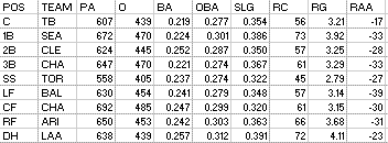
I thought it would be fun to run a chart this year of the worst hitting teams at each position, which I have not done before. The best hitting teams at each position is boring, because the best players play almost all the time, and they usually play the same position. So it’s not at all interesting to report that the best hitting third base outfit was in the
Teams managed to overcome one bad position, as
A junk final thing I like to look at is the correlation, on a team level, between the long-term PADJ and the positional RGs. A positive correlation indicates that the team got their biggest offensive contributions from the left end of the defensive spectrum positions that you would expect; negative correlations indicate the opposite. Here are the team correlations (pitchers are not included for anyone and DH not for the NL). “AVG” is the average of the team figures, while “MLB” is the correlation between PADJ and RG for each position in the majors, individually:
I will show the data for three teams: the Astros, who had the strongest positive correlation; the Orioles, who had the weakest correlation; and the Yankees, who had the strongest negative correlation. The chart shows the position’s RG, the position’s ARG against the overall team RG (for the positions considered, i.e. no pitchers or NL DHs), and the 1992-2001 PADJ for each position as a benchmark:

The Astros repeat this honor; they led last year at +.91. You can see that they are weak up the middle, but get production out of the corners. Their team offensive spectrum goes 1B, LF, CF, RF, 3B, 2B, C, SS. Only CF is really misplaced relative to the defensive spectrum.

The Orioles’ correlation of +.03 is the lowest absolute correlation of any team, and you can see that by glancing at the numbers--they are over the map. The middle infielders are much better than the norm and their left fielders were the worst in baseball, but most of the other positions are fairly close to where one would expect.

The Yankees represent another repeat leader, as the correlation was the same -.34 in 2006. Six of their nine positions went the opposite way of what you would expect (i.e. you would expect first baseman to be above average; theirs were below average).
To end frivolously, I was impressed with the similarity between the production of the Cardinals’ center and right fielders. There may be better matches out there, but this one just happened to catch my eye. CF had 637 AB, RF 638. They each rapped out 170 hits, but RF had a little more power, winning in doubles (34-30) and homers (20-19). Triples went to center fielders 3-2, and the walk column was in their favor 56-49. Adding it all up, CF made 464 outs, RF 465. The center fielders created 87 runs and right fielders 86, giving them a 4.71 to 4.66 RG edge.


Patriot, if you didn't know, positional splits are available every year here:
ReplyDeletehttp://www.baseball-reference.com/pi/bsplit.cgi?lg=ML&team=TOT&year=2007
Very cut/pastable...